
Economy & Finance
How Payday Loans Trap Borrowers
Payday loans promise quick cash — often in minutes — with no credit check. But behind the convenience is a fee structure designed to keep borrowers paying without ever catching up.
So how do these loans really work, and why don’t traditional banks step in with better options?
💵 What They Are
A payday loan is a short-term advance, typically $300–$500, due in full on your next payday. Lenders charge a flat fee — often $15–$45 per $100 borrowed — instead of a traditional interest rate.
📈 How the Costs Add Up
That flat fee sounds manageable, but rolled over every two weeks, it’s the equivalent of a 300%–400% APR. Pay $45 every two weeks on a $300 loan, and after 16 weeks you’ve spent $360 in fees — and you still owe the original $300. Even if you chip in $50 toward principal each period, you’ll pay $450 total before you’re free.
⚖ Why People Use Them
Payday loans fill a gap for borrowers with bad credit or no savings who face urgent expenses — car repairs, medical bills, rent. For many, they’re the only fast cash option when banks won’t approve small-dollar loans.
💡 Why Aren’t Banks Lending?
In theory, banks could offer small, short-term loans at reasonable rates — and some credit unions do. But most large banks avoid this space, citing risk, regulatory burden, and low profit margins. They like to spend — on dividends, buybacks, and big-ticket loans — but they don’t want to lend small.
“Fast money, slow escape.”
Full chart and explainer in the video here.
S&P 500 vs. Fortune 500: Different Lists, Same Giants
Two lists dominate the business world’s bragging rights: the S&P 500 and the Fortune 500. Both are home to household names — but they measure success in very different ways.
So, what makes a company a stock market all-star versus a revenue powerhouse? And why do only a handful manage to be both?
📊 What Are They?
The S&P 500 is a stock market index tracking the performance of 500 large U.S. companies, chosen for their market capitalization, liquidity, and sector balance. Think of it as Wall Street’s scoreboard for corporate value.
The Fortune 500 is a ranking of America’s largest companies by total revenue, published annually by Fortune magazine. It’s less about stock price and more about sheer sales volume.
🛠 How They’re Built
The S&P 500 is weighted by market cap, meaning companies with higher stock valuations carry more influence on the index. It’s rebalanced quarterly, and membership can change if a company’s performance slips or a newcomer rises.
The Fortune 500 is a straight revenue ranking from the latest fiscal year. Public and private companies are eligible — as long as they file U.S. financials — which is why you’ll see some non-public giants here that never appear in the S&P.
🔍 Where They Overlap (and Don’t)
Our comparison chart shows the overlap. Tech titans like Apple, Microsoft, and Amazon are heavyweights on both lists. But Tesla and Nvidia make the S&P 500 without cracking the top Fortune 500 spots by revenue — and Walmart dominates the Fortune 500 without playing in the S&P at all.
💡 Why It Matters
The S&P 500 tells you which companies are market darlings — often reflecting investor confidence, growth potential, and profitability. The Fortune 500 reveals the biggest revenue engines — even if their stock market performance lags.
For investors, analysts, and even job seekers, understanding both lists helps separate “high value” from “high volume.” And in today’s economy, the sweet spot is being both.
“Value wins headlines. Volume pays the bills.”
Check the chart in Projects to see the full breakdown.
Behind the Unions: 11 Million Strong
One in ten U.S. workers is part of a union - over 11 million people across education, healthcare, logistics, and entertainment.
But what exactly are unions? How do they form? And why do they still matter half a century after their peak?
📦 What Are Unions?
Unions are organizations formed by workers to negotiate with employers as a group. They fight for wages, safety, and benefits - and protect members from unfair treatment. They’re not just for truckers or factory workers: teachers, nurses, and even Hollywood actors are union members too.
🛠 How Are They Formed?
Most unions start small: a handful of workers organizing around shared frustrations. Once enough sign on, they hold a vote overseen by the National Labor Relations Board (NLRB). A majority wins recognition. From there, members bargain for a contract - and defend it through grievance processes and, sometimes, strikes.
💪 How They Help (and Sometimes Hurt)
Unions can raise pay, improve safety, and secure benefits like healthcare and retirement. They provide protection from sudden firings and give workers a voice in scheduling and workload. But not every union is perfect - dues can feel heavy, contracts can disappoint, and internal politics sometimes alienate members.
⏳ Why It Mattered 50 Years Ago
In the 1950s and ’60s, unions covered one in three workers. They were the backbone of the middle class, powering fair wages and major social reforms. Their strikes reshaped industries - and their influence reached into politics, civil rights, and safety laws.
🔥 Why It Still Matters
Today, union membership has fallen to about 10%. But public support is the highest it’s been since the 1960s, and new movements are rising at Starbucks, Amazon, and across healthcare. In an era of rising costs and gig work, collective power might be more vital than ever.
“Big muscle. Big potential.”
Behind every percentage point are real people - and real stakes. That’s why unions, old and new, still matter.
Perfect Driver, Perfect Math… So Why Are Rates So High?
What?
What happens if you have a spotless driving record? No tickets. No accidents. Ten years of clean driving. You’d expect to pay about $1,600 a year for car insurance in California, right?
That’s exactly what the data says you should be paying - it’s what California’s own insurance filings predict for drivers with clean histories and neutral vehicles.
How?
Insurers in California are required to file their rate-setting formulas with the Department of Insurance. These filings break premiums into weighted factors - things like years licensed, commute type, vehicle performance, violation points, and discounts (multi-car, good driver). Each factor is assigned a multiplier that adjusts a statewide base premium up or down.
We extracted these multipliers from the publicly filed templates and applied them against a dataset of over 10,000 vehicles. For each driver profile, we calculated a proxy score by multiplying their factor weights together, then applied discounts (if eligible) to estimate a final premium. This mirrors the methodology insurers use internally - only we’re doing it out in the open.
When we run this math on perfect drivers - clean records, neutral ZIP codes, average vehicle performance - the average premium lands right at $1,600/year. That’s the benchmark.
Why?
If you’re paying more than that, it’s not because of your driving - it’s because of hidden surcharges: wildfire risk adjustments, territorial rebalancing, or broad “trend” increases insurers bake in above the filed math. These extra layers are rarely visible to customers, but they quietly add hundreds to annual premiums.
View the California rate filings here
📦 Target’s Big Shrink Story: It’s Not Just Theft
When Target blamed its poor 2023 performance on retail theft, the headlines wrote themselves. Politicians pointed fingers. Retail analysts shook their heads. And everyone moved on.
But now that Target’s full annual report has dropped, it’s time for a deeper look. And what we see is... shrinkflation of a different kind.
The Theft Story (Sort of True)
Target claimed $600 million in losses due to theft — a bold stat that drew a ton of media attention. But in the context of Target’s $107 billion in revenue that year, it’s less than 0.6%. That’s not nothing, but it’s far from catastrophic.
It’s also worth noting that “shrink” — retail-speak for inventory loss — can include theft, sure. But it also includes broken items, vendor fraud, clerical errors, miscounts, and even items that just go missing in warehouses. In other words, it’s messy.
The Real Cut: Operating Income
In 2022, Target made $3.8 billion in operating income. In 2023? Just $1.2 billion. That’s a two-thirds drop, and much more alarming than shrink alone. The culprit? Higher wages, inflation, logistics costs, and poor inventory bets that didn’t move off shelves.
This isn’t just a shoplifting story — it’s a supply chain and strategy story. Blaming shrink makes for better headlines than admitting you misjudged consumer trends or got burned on shipping contracts.
And Yet…
Target’s stock has recovered in early 2025. They’ve adjusted, trimmed costs, and started moving more product again. It’s not a happy ending, but it’s not a death spiral either.
Still, the next time a retail giant blames “shrink,” check the footnotes — and the operating line. It’s usually more telling.
Pop Culture & Media
Twelve Walked. Three Almost Didn't Return.
Between 1969 and 1972, twelve humans walked on the Moon.
Each mission sent a team of three: two would descend in the Lunar Module and walk on the surface. One would remain in orbit, alone in the Command Module, ensuring they all got home.
But not every mission made it to the surface.
🚀 Who Walked on the Moon
The Moon landings followed a pattern: Commander and Lunar Module Pilot would touch down and explore the lunar surface. The Command Module Pilot would stay above, watching over everything from orbit.
- 1969: Apollo 11 (Armstrong, Aldrin), Apollo 12 (Conrad, Bean)
- 1971: Apollo 14 (Shepard, Mitchell), Apollo 15 (Scott, Irwin)
- 1972: Apollo 16 (Young, Duke), Apollo 17 (Cernan, Schmitt)
Twelve men walked on the Moon. No one has followed since.
🛑 1970: The Mission That Didn't Land
Apollo 13 was scheduled to be the third lunar landing. But 56 hours into the flight, an oxygen tank exploded. The mission was aborted. The Lunar Module became a lifeboat. The Moon was no longer the goal-survival was.
Jim Lovell, Jack Swigert, and Fred Haise never touched lunar soil. But they came home against impossible odds. In many ways, their mission was more heroic than a landing ever could be.
“Houston, we’ve had a problem.” -Jack Swigert
🌍 Why It Stopped
After Apollo 17, the Moon program ended. Public interest faded. Budgets shrank. NASA shifted focus to Skylab, then the Space Shuttle.
The boots stopped. The silence began.
✨ Why It Still Matters
The Moon remembers. Our footprints are still there.
Every Moon Day, we remember the boldness of what was done-and the courage of those who almost didn’t make it back.
Sometimes, the most powerful missions are the ones that turn back.
The Big Count – How Nielsen Ratings Still Shape What We Watch
Every week, we’re told what “America” is watching - but have you ever wondered how they know? You’ve probably never had a Nielsen box in your house, and yet entire shows rise and fall based on the data it captures.
📺 What Are Nielsen Ratings?
Nielsen ratings are a statistical estimate of what U.S. households are watching on TV. Created by Arthur C. Nielsen in the 1950s, the system was designed to give advertisers a sense of which programs attracted the most eyeballs. In an era before streaming, that data was gold.
The idea? Measure a small number of real households in detail, and extrapolate the results to represent the entire nation. If 500 homes are watching Wheel of Fortune out of 5,000 sampled, that’s modeled as 10% of the national audience.
📊 How It Actually Works
Despite the digital age, Nielsen still relies on a relatively small sample - tens of thousands of households - to represent over 120 million TV homes. These panel homes use meters to track viewing habits. Some participants even fill out old-school viewing diaries.
Why haven’t you ever had a box? Because the sample is carefully selected to reflect geographic, demographic, and socioeconomic diversity. If you’re not in that target grid - or you didn’t say yes to their invitation - you’re not in.
🤔 Why It Still Matters
Even in the age of streaming, traditional ratings still shape ad spending, renewals, and cancelations. But they also feed into cultural perception. Ever feel like “everyone” is watching a show you’ve never heard of? Or the opposite - you love a series that vanishes without a trace? That’s the ratings echo chamber at work.
It’s why shows with niche but passionate audiences - like Law & Order: SVU - can look like underdogs on paper. But if SVU aired a full 22-episode season instead of summer splits, its total viewership could top 30 million. Ratings are often about timing, not just popularity.
So the next time you hear that something is "the #1 show in America," remember: it's probably not about *your* remote - it’s about a box in someone else's living room.
Where Are All the Stars?
Michelin star restaurants are clustered in just a few American cities-New York, San Francisco, Chicago, DC. That leaves most of the country blank on the fine-dining map. But the reasons have less to do with food quality and more to do with inspection coverage.
🍴 How the Michelin System Works
The Michelin Guide wasn’t born from foodies-it was born from tires. In 1900, the Michelin tire company (yes, that Michelin) created a guidebook to encourage more road travel-more travel meant more worn tires, which meant more tire sales. The original guide included maps, mechanic listings, and eventually... restaurants.
By 1926, they started awarding stars for fine dining. One star meant “a good place to stop,” two was “worth a detour,” and three? “Worth a special journey.”
🚗 The more stars, the more miles. And more tires.
That legacy lives on. Today, Michelin’s system rewards not just food quality, but consistency, originality, and a sense of destination. That’s why metro areas with dense luxury scenes-like New York, SF, DC, and Chicago-dominate the map.
📍 What’s Missing
The flip side? Entire regions full of authentic, cultural, and creative cuisine - think the American South, the Great Lakes, or the Rockies - often go unrecognized. Not because they lack flavor, but because they lack inspection presence. Michelin only rates select cities, and if your region isn't in the rotation, your star chances are zero.
"That Boy's Got a License Hold" – Why Sling Blade Isn’t Streaming Anywhere
If you went hunting for Sling Blade last weekend and came up empty, you're not alone. Despite its Oscar-winning script, powerhouse performance from Billy Bob Thornton, and cult-favorite status, it’s strangely absent from all major platforms. No Netflix. No Prime. No Hulu. Not even a rental option on YouTube.
This isn’t a fluke – it’s a rights puzzle.
The Licensing Black Hole
Sling Blade is one of those films caught in what you might call a "licensing ghost zone." It's distributed by Miramax, a studio that has been through several ownership changes. With shifting corporate hands, sometimes the contracts get... well, misfiled. Or they age out. Or the rights revert. Or nobody knows who to call.
Some outlets suggest the rights may still be entangled in outdated deals that didn't account for modern digital distribution. If streaming rights weren’t included when a movie was first licensed, they can require new negotiation - which nobody might have prioritized for a '90s drama, even a classic one.
So Where Is It?
Right now, Sling Blade isn’t licensed for active streaming or even digital rental. Physical media is your best bet. If you’ve still got a DVD player (or a friend with one), this is the time to break it out. Otherwise, your only option might be piracy - and we’re not advocating that.
The Big Picture
Sling Blade is just one of many films lost in this digital twilight zone. If the film doesn’t have a passionate advocate inside a studio or distributor pushing to renew the rights and push it forward, it falls through the cracks. Quietly. Frustratingly.
So until someone with the keys at Miramax (or whoever’s steering that ship today) decides to unearth the licensing, Karl Childers will remain trapped in a vault.
Environment & Science
The Nurse Pipeline: Building Tomorrow’s Care Today
By 2031, the U.S. will need nearly two million new registered nurses - about 193,000 every year - just to keep pace with retirements and the needs of an aging population. But our current system waits too long to recruit: most people don’t consider nursing until college, by which point the pipeline is already behind demand.
So what would it look like if we started earlier? What if nursing was a conversation by high school, not after?
🧾 What’s the Shortage?
The American Association of Colleges of Nursing projects a cumulative shortfall of over 78,000 full-time nurses by 2025, with annual openings averaging nearly 200,000. This isn’t just turnover - it’s growth. Healthcare is expanding fast as the 65+ population rises from 58 million today to 82 million by 2050. More patients. More care. Fewer nurses.
Current strategies - college recruiting fairs, second-career transitions - aren’t enough. By the time most nurses enter the profession in their mid‑20s, the shortage is already baked in.
🧭 How to Fix the Pipeline
Start at 16. High school sophomores can explore nursing through dual‑credit programs, CNA training, or volunteer work at local clinics. By 18, they’re ready for nursing school - graduating at 22 with an associate’s or 24 with a bachelor’s. That means licensed RNs enter the workforce just as demand peaks, rather than years too late.
Using U.S. Census data, about 58 million Americans are currently between 16 and 24. To fill the 2‑million nurse need by 2031, roughly 3% of those youth - one in thirty - would need to choose nursing.
🌟 Why It Matters
Nursing is more than a career: it’s the front line of public health, emergency care, and aging support. Without enough nurses, ER wait times stretch, rural hospitals close units, and patient outcomes suffer. Fixing the pipeline isn’t just about filling jobs - it’s about safeguarding entire communities.
“A sustainable nursing workforce starts in high school, not after college.”
Meeting tomorrow’s demand means inspiring the next generation today - because by the time we feel the shortage, it will already be too late.
The Great Plateau – What Happened to America’s Mental Health Recovery?
Between 2020 and 2023, America made meaningful strides in mental health recovery. The number of adults reporting anxiety and depression symptoms dropped sharply. But in 2024, that progress flatlined.

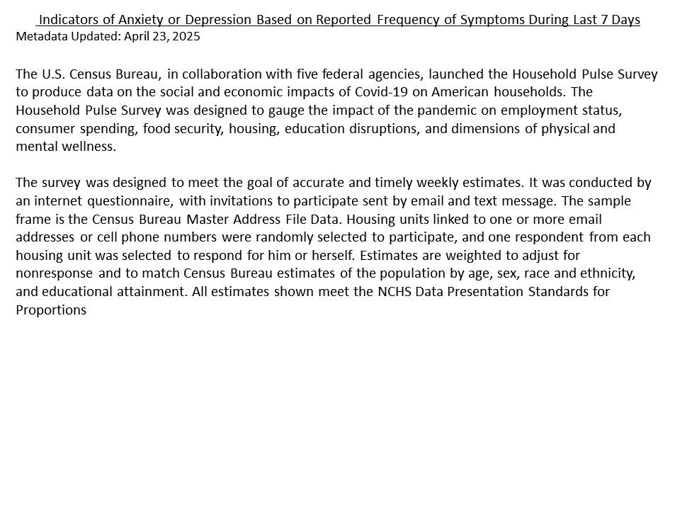
The Data
The Household Pulse Survey conducted by the U.S. Census Bureau tracks mental health indicators across all 50 states. It uses tools like PHQ-2 and GAD-2 to assess the percentage of adults reporting frequent symptoms of anxiety or depression.
From a high of over 32% reporting elevated risk in 2020, the national trend steadily declined through 2023. But 2024’s data suggests we’ve hit a plateau. In some states, the numbers have even ticked upward again.
Winners & Stragglers
States like West Virginia, Kentucky, and Idaho showed the strongest improvement - with more than 8% reductions in high-risk populations. On the other hand, states like Minnesota, New Jersey, and Massachusetts remain relatively flat.
Why It Matters
This data gives us a glimpse at the long tail of pandemic impact. Mental health support systems surged in 2021 and 2022 - telehealth, community programs, and employer awareness all played a role. But without continued investment, we risk losing momentum.
If you’re wondering how your state compares or why this shift matters, you’re not alone. But if 2024 is the stall year, 2025 could be the bounce - if anyone’s paying attention.
Sports & Culture
Have a story? Contact Bamlytics.