Economy & Finance
🏢 Corporate Tax Rates by State
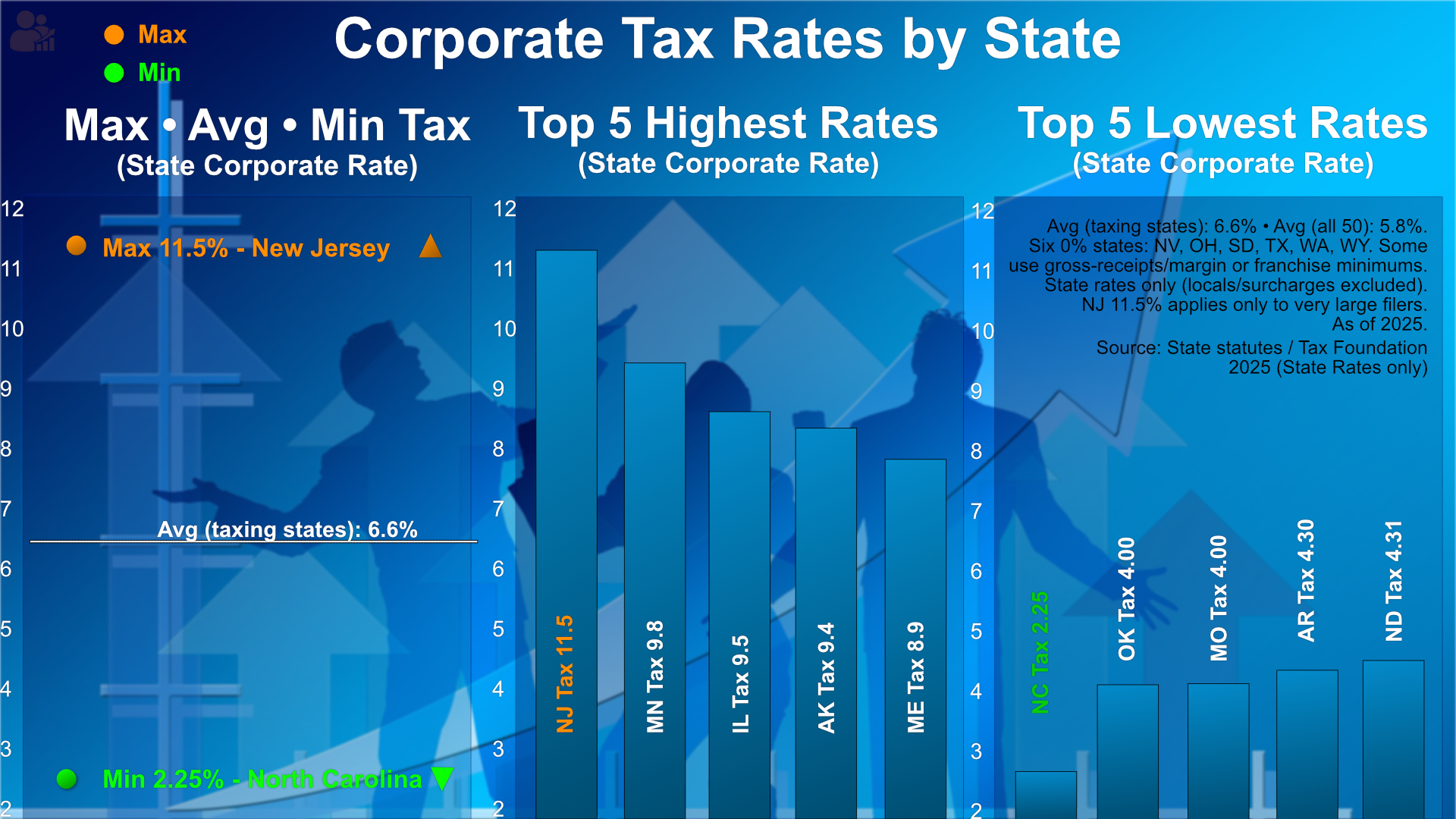
State corporate taxes vary widely. New Jersey tops the list at 11.5%, while North Carolina sits at the low end with just 2.25%. The average among taxing states is 6.6%, while six states levy no corporate tax at all.
These differences shape where businesses choose to operate — from high-rate hubs like Minnesota and Illinois to low-rate states like Oklahoma and Missouri.
Source: State statutes & Tax Foundation, 2025.
🌮 Taco Price Index (PPT)
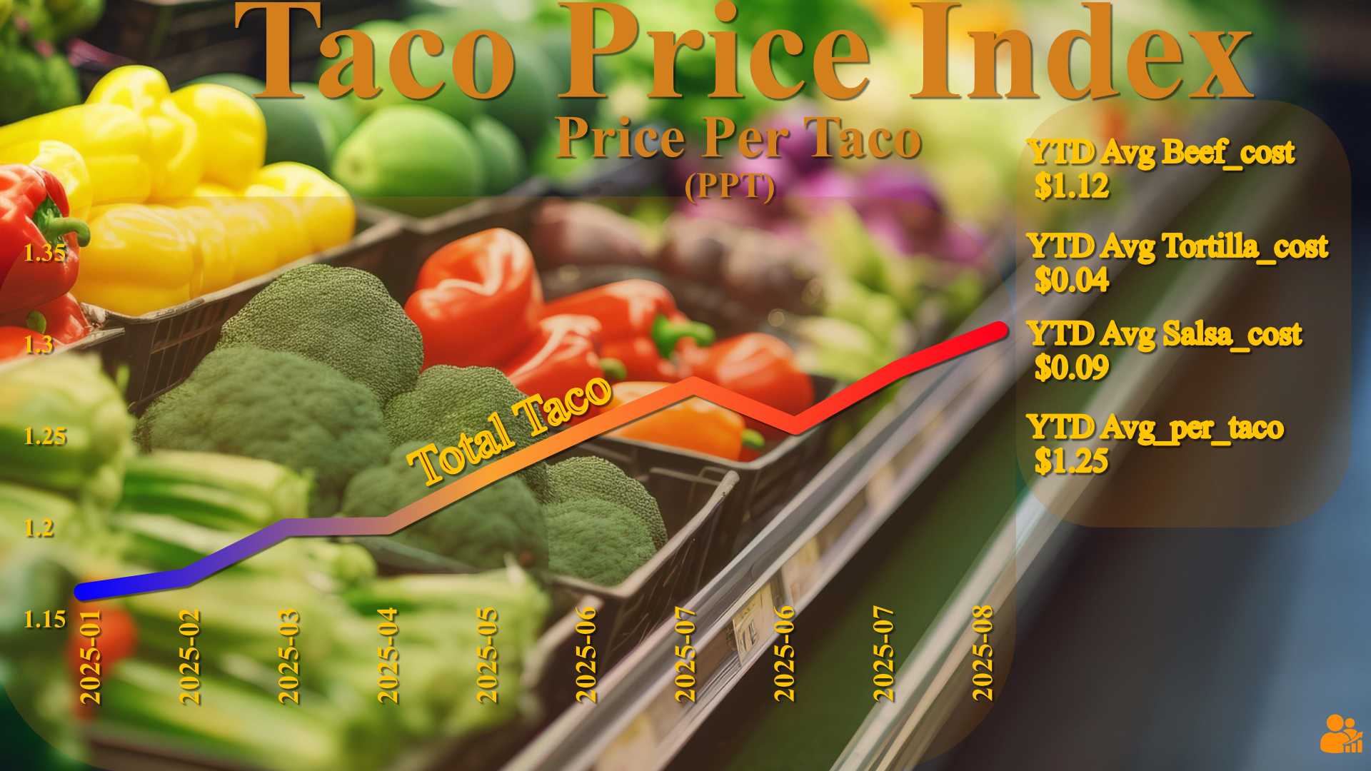
A simple, transparent food-cost gauge: the Price Per Taco (PPT) blends retail prices for beef, tortillas (flour), and salsa inputs (onions + tomatoes). The 2025 line climbs from early-year lows toward mid-year highs, with a YTD basket average near $1.25 per taco.
Component averages shown at right help separate what’s driving the move (protein vs. staples). Built from official series to keep the “fun index” grounded in real data.
Source: USDA Economic Research Service (ERS) & USDA retail series, 2025.
📱 First-time Online Digital Payments
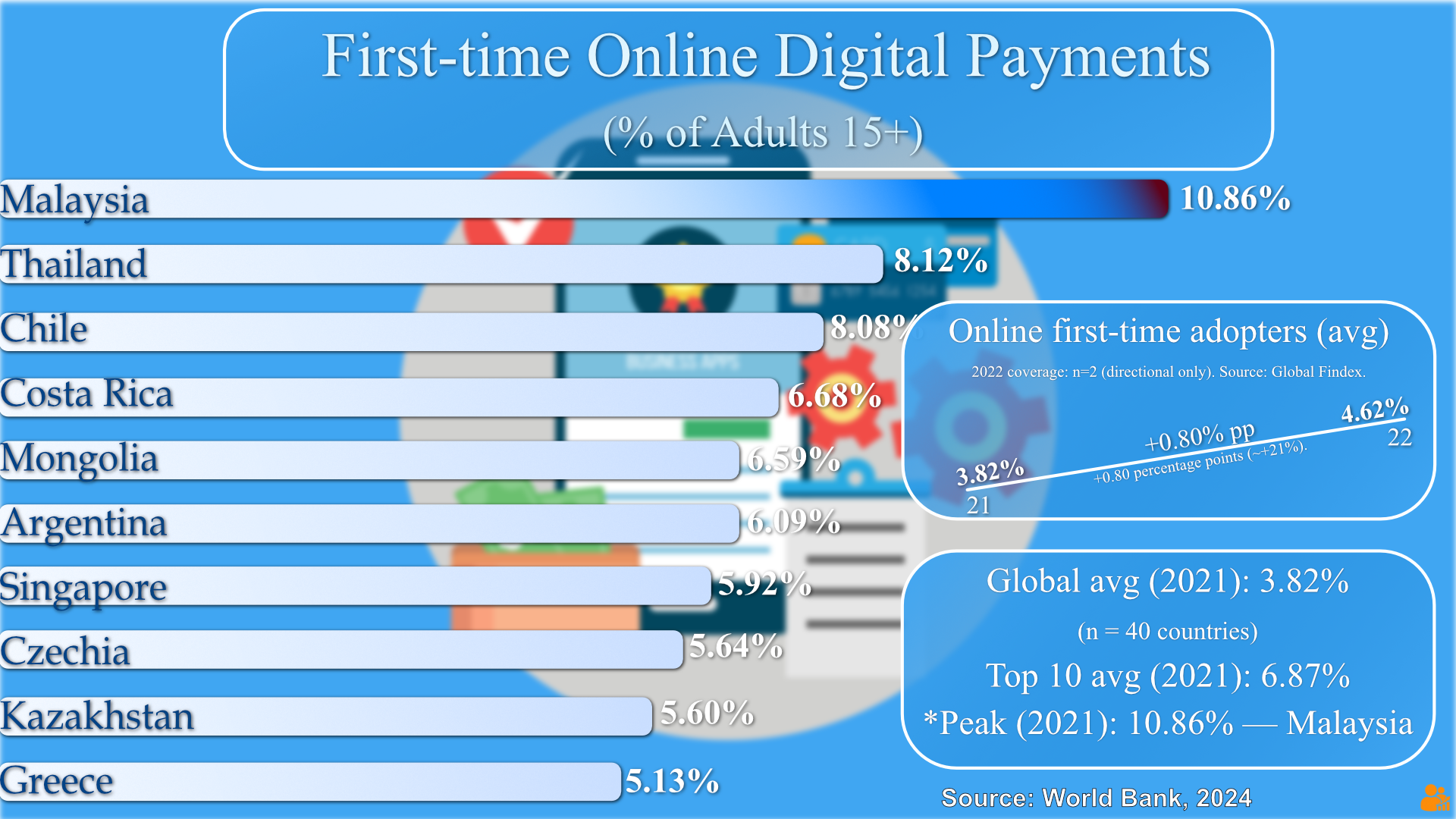
Digital payment adoption is accelerating worldwide. In 2021, Malaysia stood out, with nearly 11% of adults making their first-ever online payment - more than double the global average of 3.82%.
Other emerging adopters include Thailand (8.1%), Chile (8.0%), and Costa Rica (6.7%). By 2022, the global average ticked up to 4.6%, reflecting steady but uneven growth across regions. Singapore, Argentina, and Mongolia are also notable movers.
Source: World Bank – Global Findex, 2024.
💰 Top 10 Bribery Rates — 2024
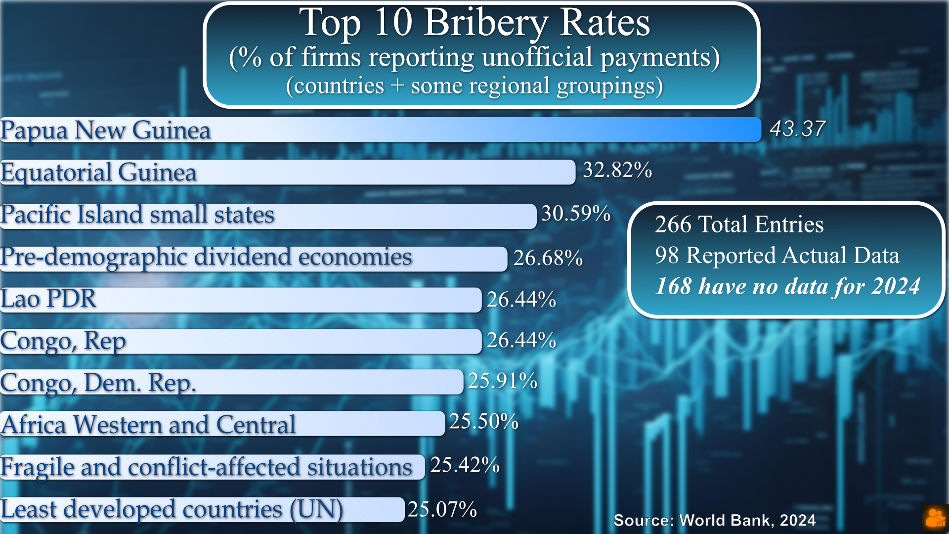
The World Bank’s 2024 Enterprise Survey shows the share of firms reporting unofficial payments across 266 entries, with Papua New Guinea topping the list at 43.37%.
Regional patterns reveal high rates in small island states, parts of Africa, and pre-demographic dividend economies — with 168 countries lacking current data, underscoring reporting gaps in global transparency metrics.
📊 S&P 500 vs. Fortune 500
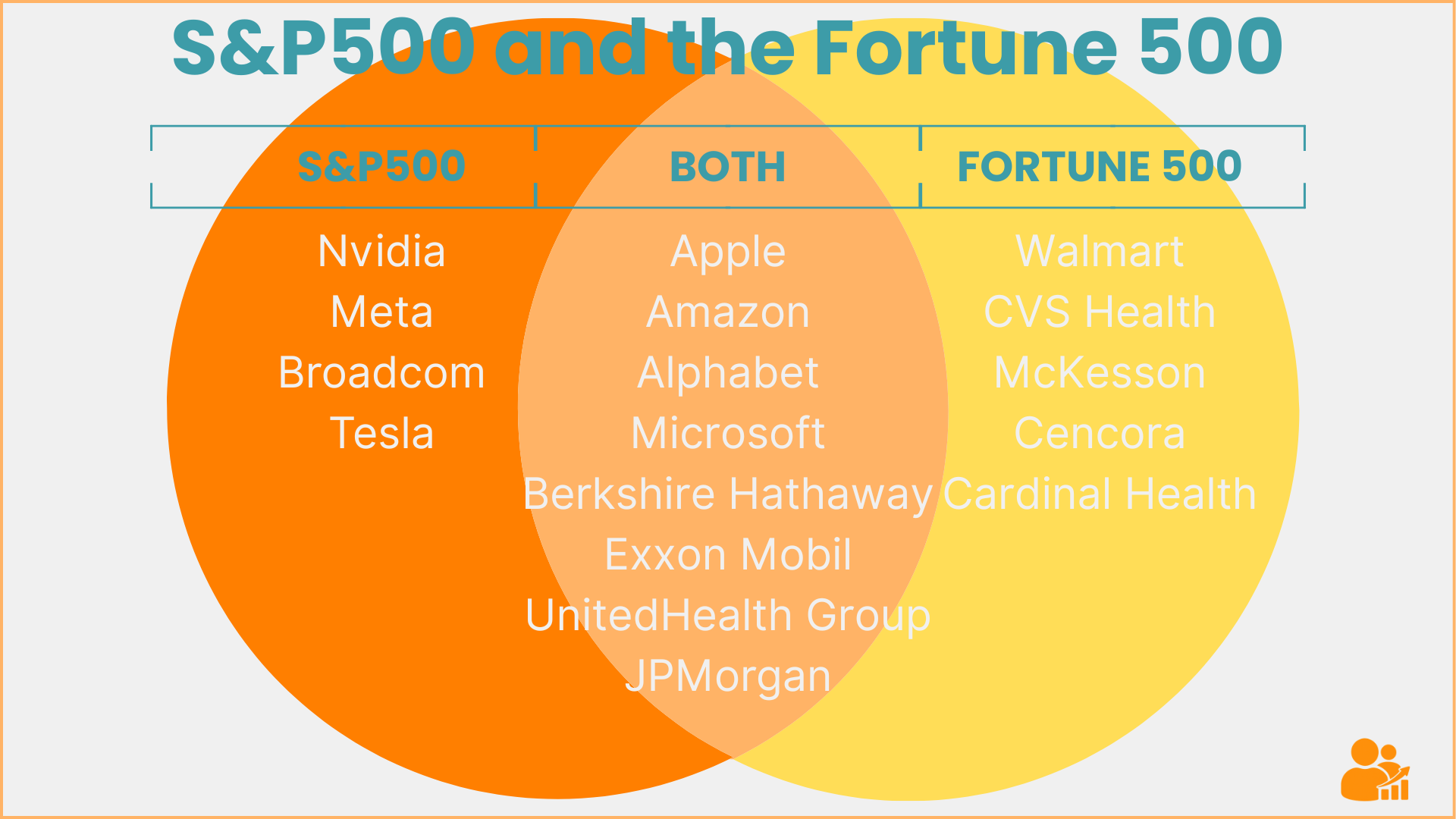
Index vs. revenue: who’s in the markets’ flagship index, who leads by sales, and the elite overlap that does both.
Full breakdown in the economy story.
💸 How Payday Loans (Don’t) Work

$300 can become $660 in fees—and you still owe $300. The math, the trap, and a saner alternative structure.
Full explainer in the economy story.
✊ Behind the Unions: 11 Million Strong
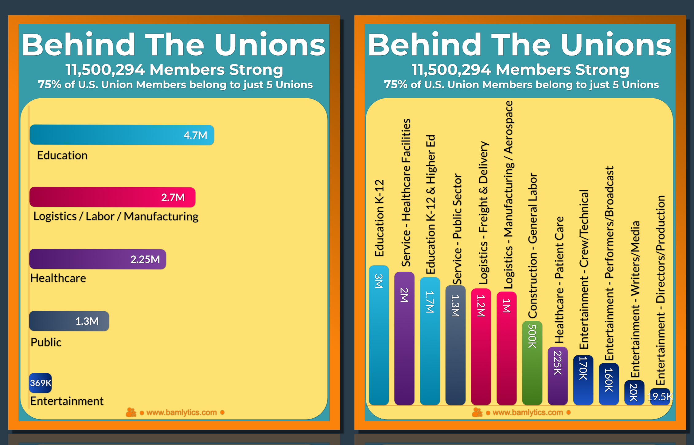
One in ten U.S. workers belongs to a union — over 11 million people across education, healthcare, logistics, and entertainment. Just five groups hold 75% of that total.
Full context and history in the union story.
🏠 Housing Price Cut Cycles (2020–2025)
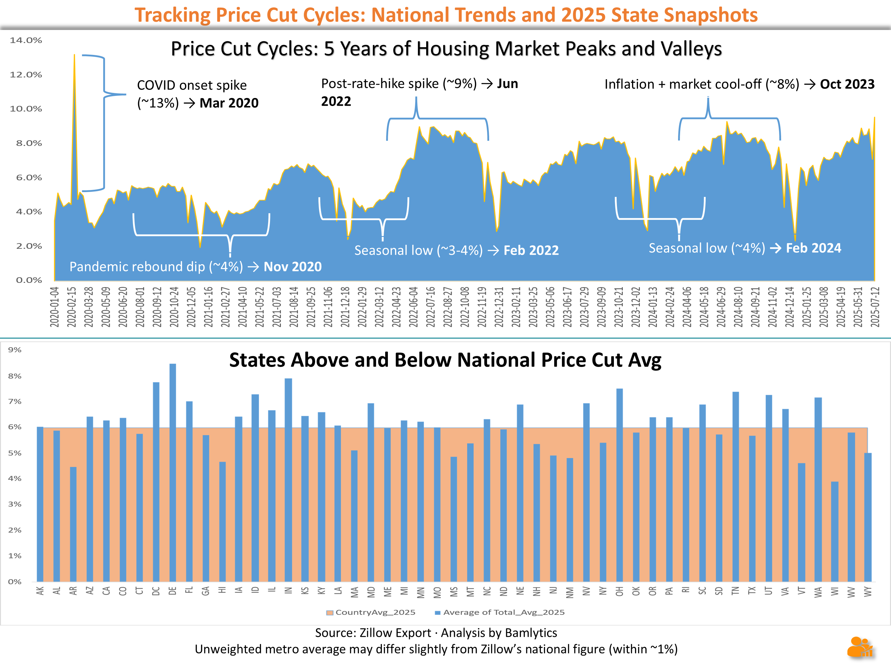
Five years of price‑cut cycles: pandemic spikes, post‑rate‑hike cooldowns, and seasonal lows. See how your state’s housing market compares to the national average.
🚗 Perfect Driver vs. Perfect Math
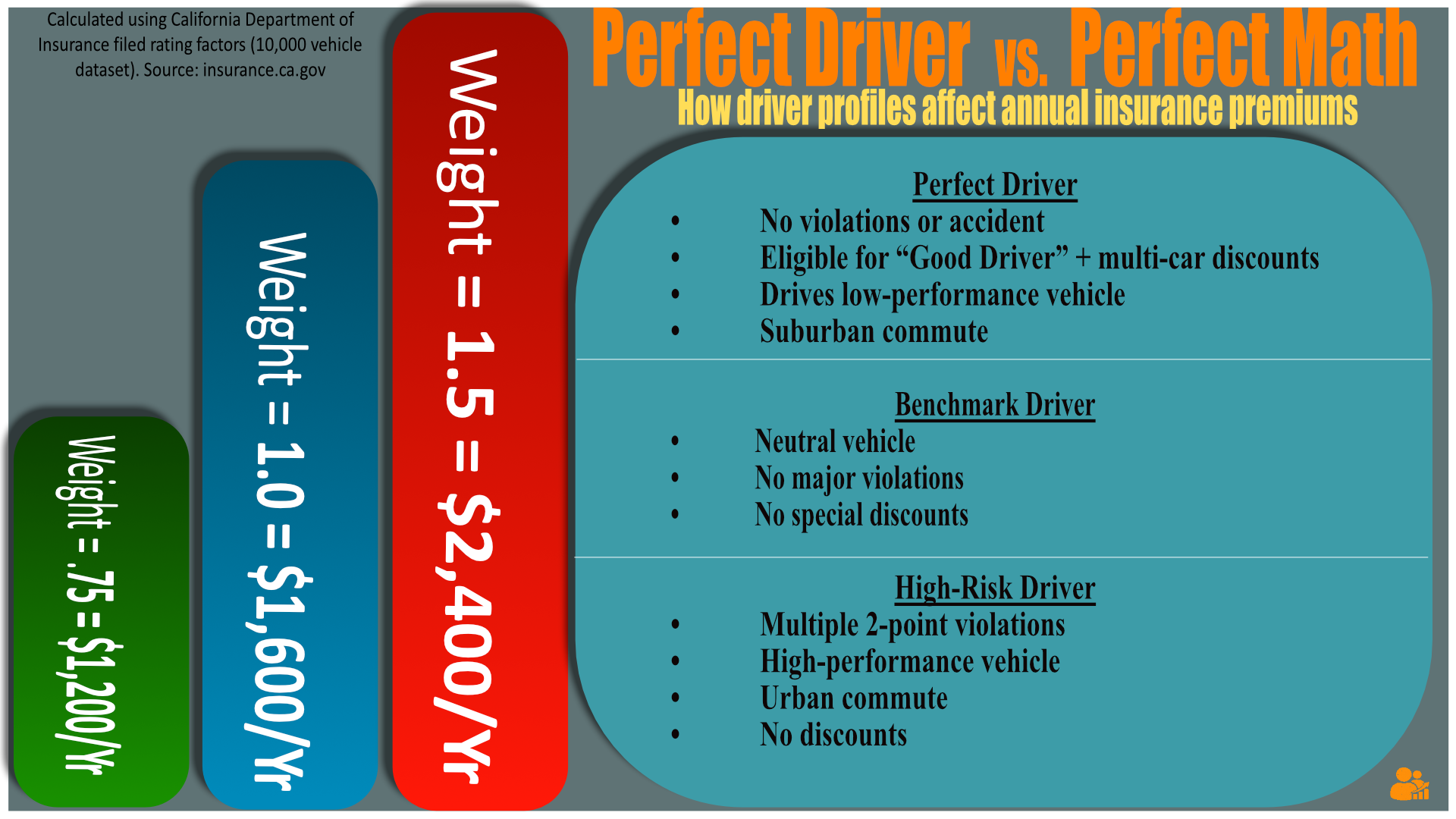
California’s own filed rating formula says a benchmark driver should pay about $1,600 a year. Perfect drivers with all discounts can drop to around $1,200, while high-risk profiles can exceed $2,400.
Based on public filings from the California Department of Insurance — applied to a dataset of 10,000 vehicles.
🛢️ Oil Prices – The Seasonal Connection
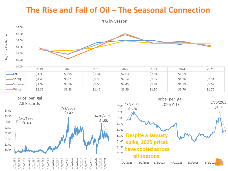
From winter lows to summer surges — U.S. crude oil prices (converted to per-gallon equivalents) have long followed a seasonal rhythm. This visual compares seasonal patterns since 2019 alongside a full-history view back to the 1980s.
While 2025 began with a sharp spike, recent months show a cooldown toward the 5-year seasonal norm. History’s biggest surges — like mid-2008 — still set the bar for volatility.
Source: EIA crude oil spot prices (converted to $/gallon), through Aug 2025.
🏠 Real Estate Closing Times – Fastest vs. Slowest States
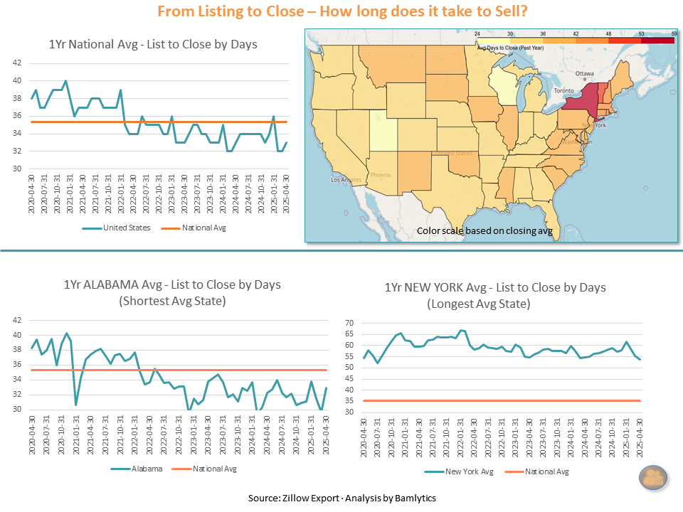
How long does it take to close a deal? This visual breaks down the average number of days from listing to close over the past year — comparing the national trend to two extremes: Alabama (fastest) and New York (slowest).
The map shows closing speed by state, while line charts reveal seasonal shifts and deviations from the national norm. Whether you're buying, selling, or just Zillow-browsing with intent, this snapshot tells you where things move fast... and where they don’t.
🐄 U.S. “Other Livestock” Export Value by State (2023)
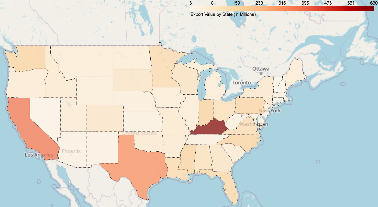
This state-by-state heatmap shows 2023 export totals (in hundreds of millions) for the USDA’s broad “Other Livestock” category — including farmed game, goats, and exotic animals.
Kentucky dominates, but California, Texas, and Ohio also show surprising volume in an often-overlooked slice of the U.S. ag economy.
🌍 Market Popularity by State
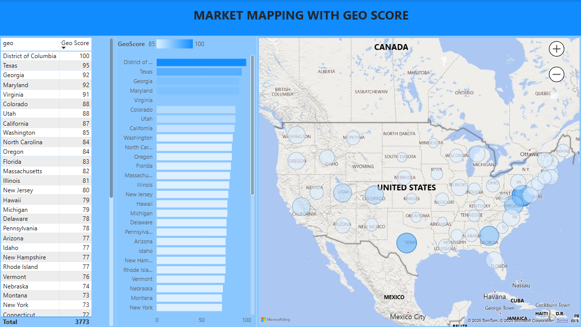
Which states are most actively engaging? This filled map uses Bamlytics' scoring system to visualize where attention is peaking across the U.S.
Pop Culture & Media
Les Senteurs de Parfum — Audience & Longevity Snapshot
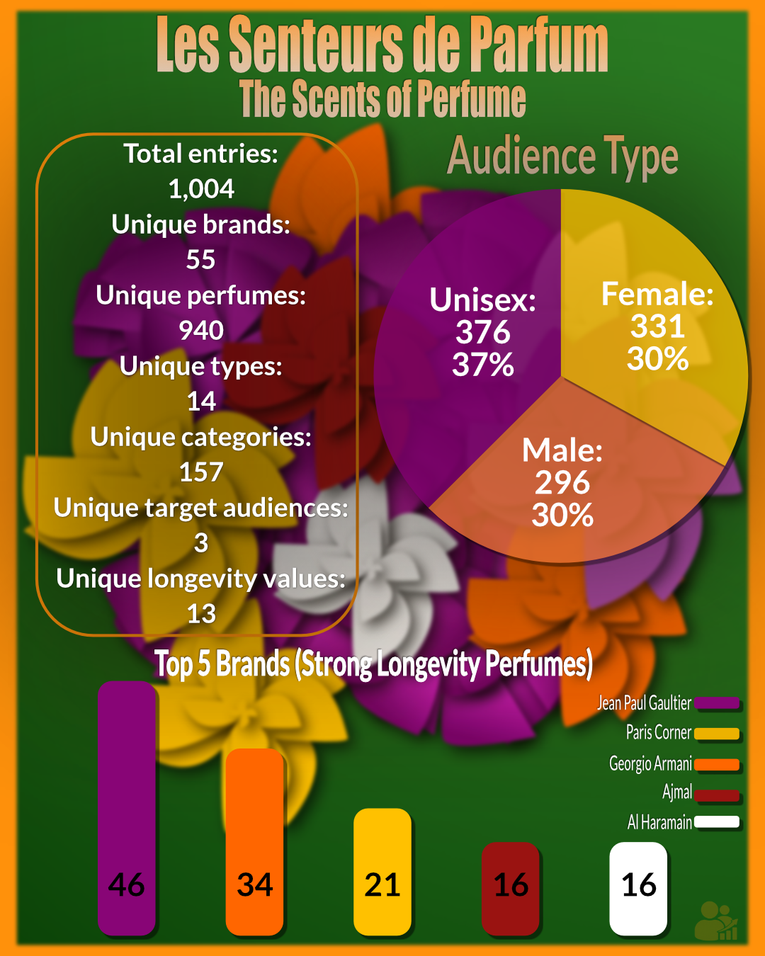
A high-level scan of the Bamlytics perfume dataset shows a strong tilt toward unisex releases (≈37%) alongside sizable female and male segments (≈30% each). The collection spans 55 brands and 940 unique perfumes across 14 types and 157 categories, with 13 longevity labels tracked.
Among perfumes noted for strong longevity, the top brand counts here are: Jean Paul Gaultier (46), Paris Corner (34), Giorgio Armani (21), and a tie between Ajmal (16) and Al Haramain (16).
Source: Bamlytics perfume dataset (1,004 entries). Percentages may not sum to 100% due to rounding.
📚 The Writings of Dr. Martin Luther King Jr.
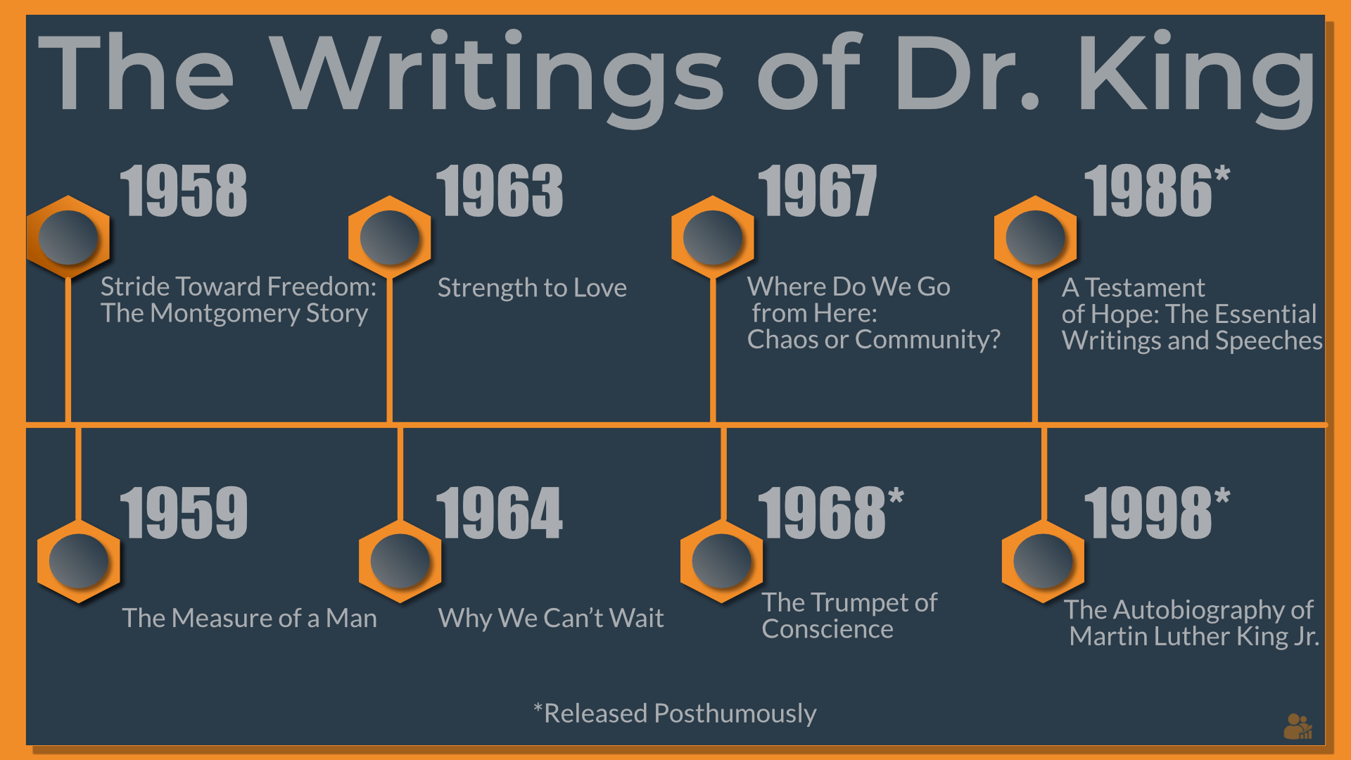
A visual timeline of Dr. King’s major writings, from Stride Toward Freedom (1958) to posthumous works like A Testament of Hope (1986). His writings are a cornerstone of American civil rights history and remain influential in discussions of justice and equality today.
This project sits at the intersection of literature, activism, and cultural memory, showing how King’s words continue to resonate decades later.
Source: Public domain records / Bamlytics
🎶 Country Songs Popularity
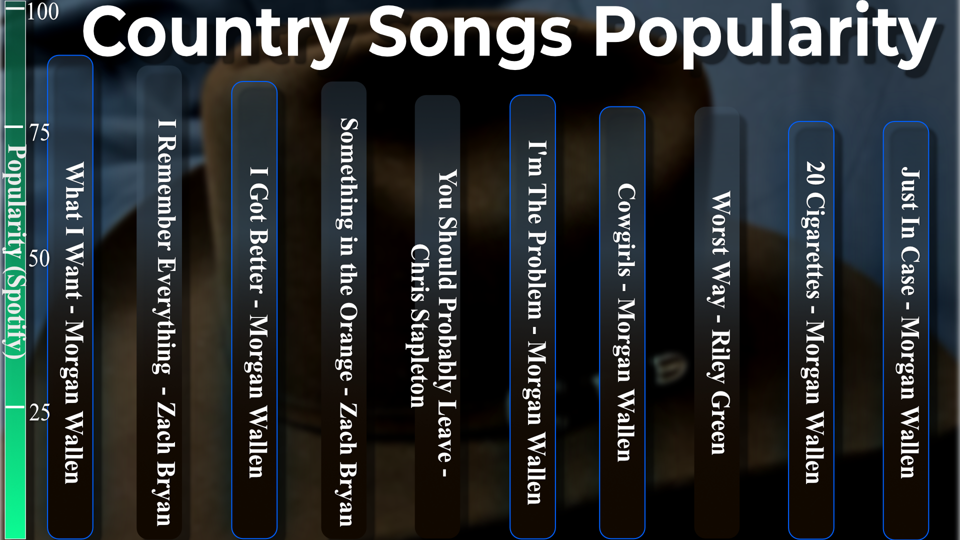
In celebration of Country Music Day, we pulled the latest Spotify popularity scores. Morgan Wallen dominated the chart with multiple entries, while Zach Bryan and Chris Stapleton also held strong spots. It’s a snapshot of what’s resonating right now across the U.S. country music scene.
This visual is a time-stamped pop culture moment, highlighting how fan favorites rise and fall in real time.
Source: Spotify API / Bamlytics
💔 Love as Horror – A Narrative Spectrum
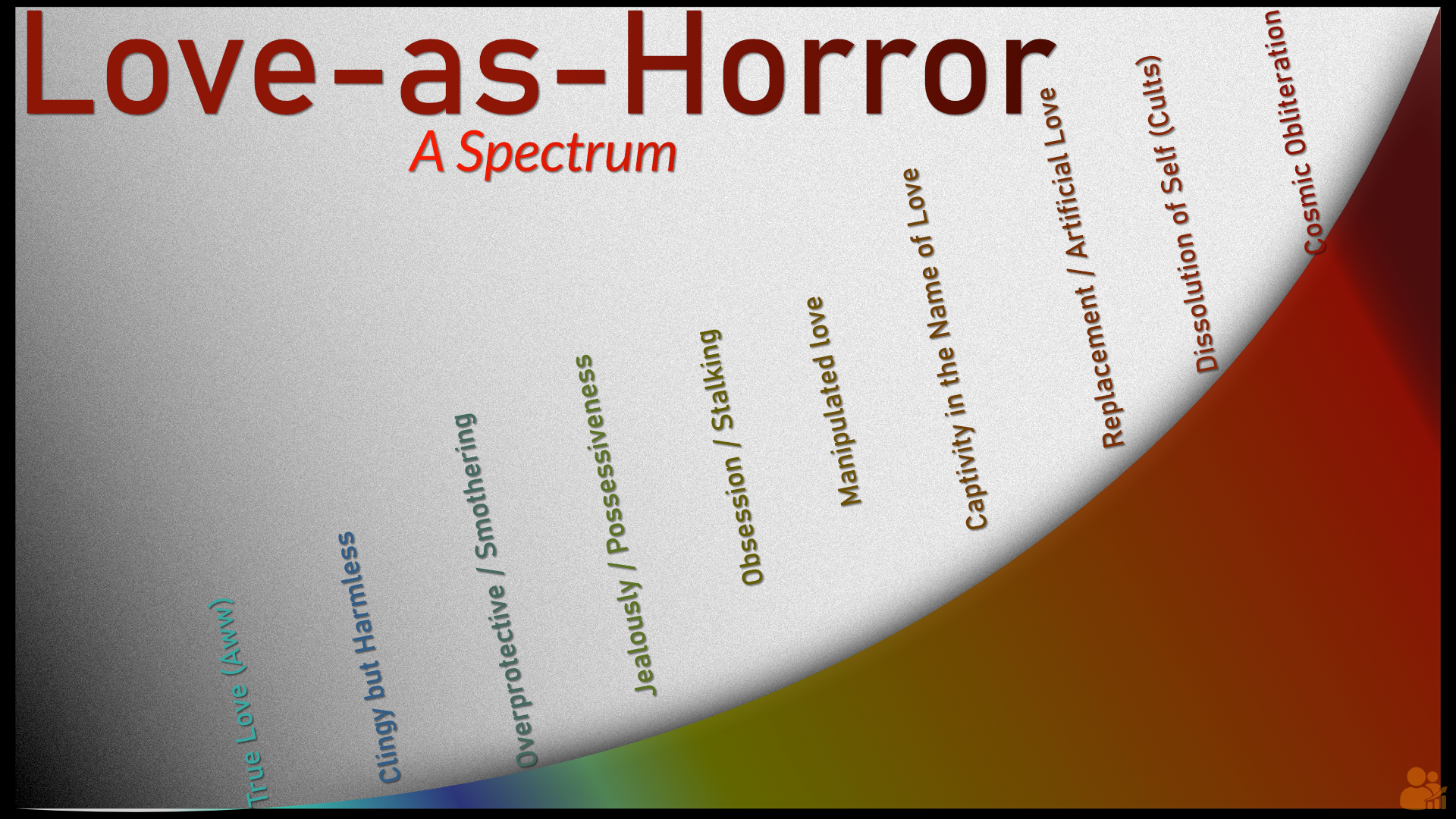
Not every love story ends with a happy kiss — some spiral into obsession, captivity, and even cosmic dread. This narrative spectrum maps love as it drifts from healthy romance to horror-story territory, with stops along the way like possessiveness, artificial love, and total loss of self.
It’s part pop culture, part literary analysis — and a reminder that some of the scariest stories start with “I love you.”
Concept and design: Bamlytics Project Studio, 2025.
🎵 The Music of Queen on Spotify
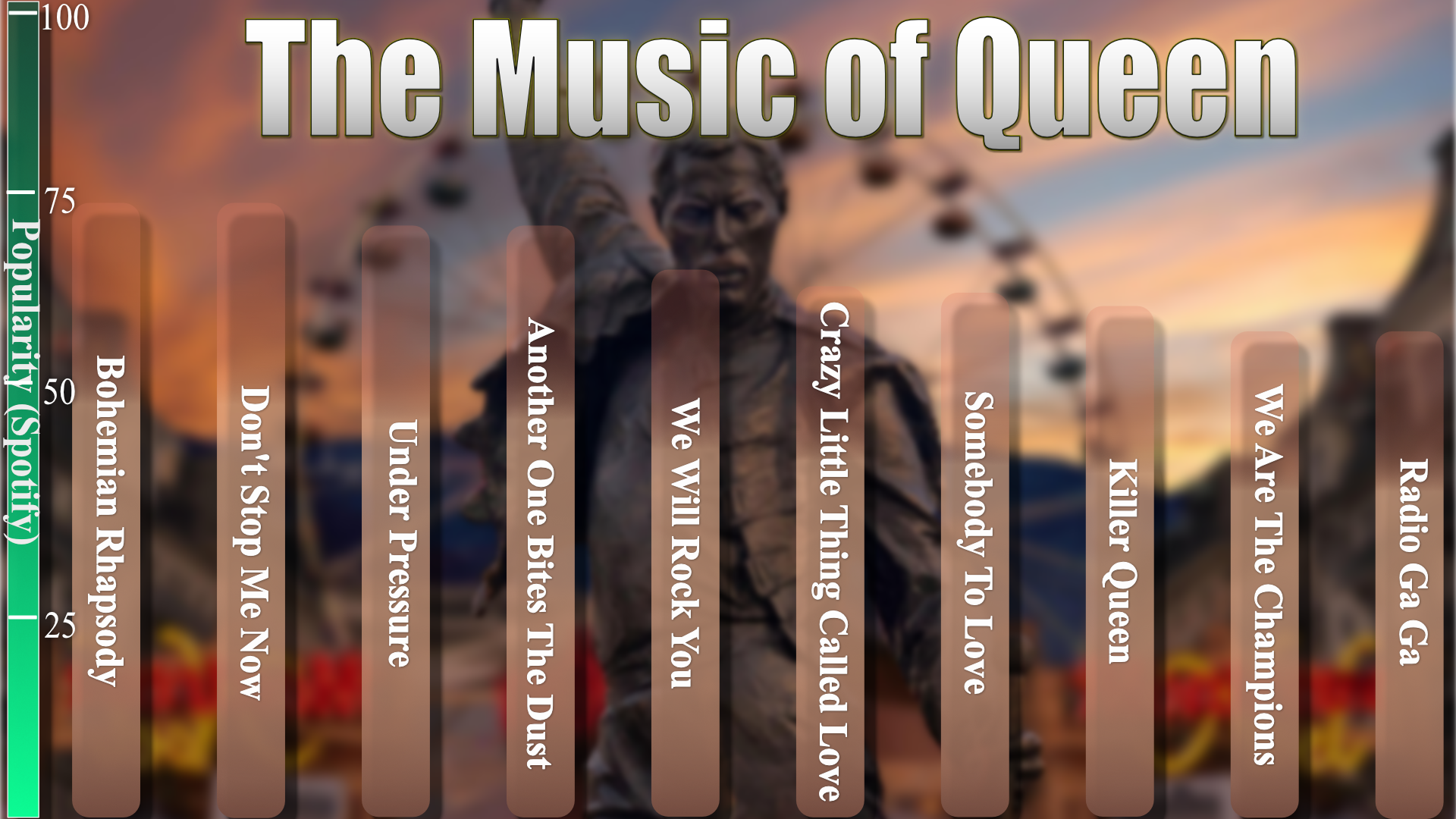
On Freddie Mercury’s birthday, we pulled Queen’s top tracks from Spotify to see how their legacy holds up in the streaming era. No surprise — Bohemian Rhapsody still reigns supreme, followed by anthems like Don’t Stop Me Now and Under Pressure.
The mix of classics across decades shows how Queen’s catalog continues to resonate with new listeners while keeping the same iconic tracks at the top of global playlists.
Source: Spotify API
📚 Mary Shelley: The Mother of Frankenstein
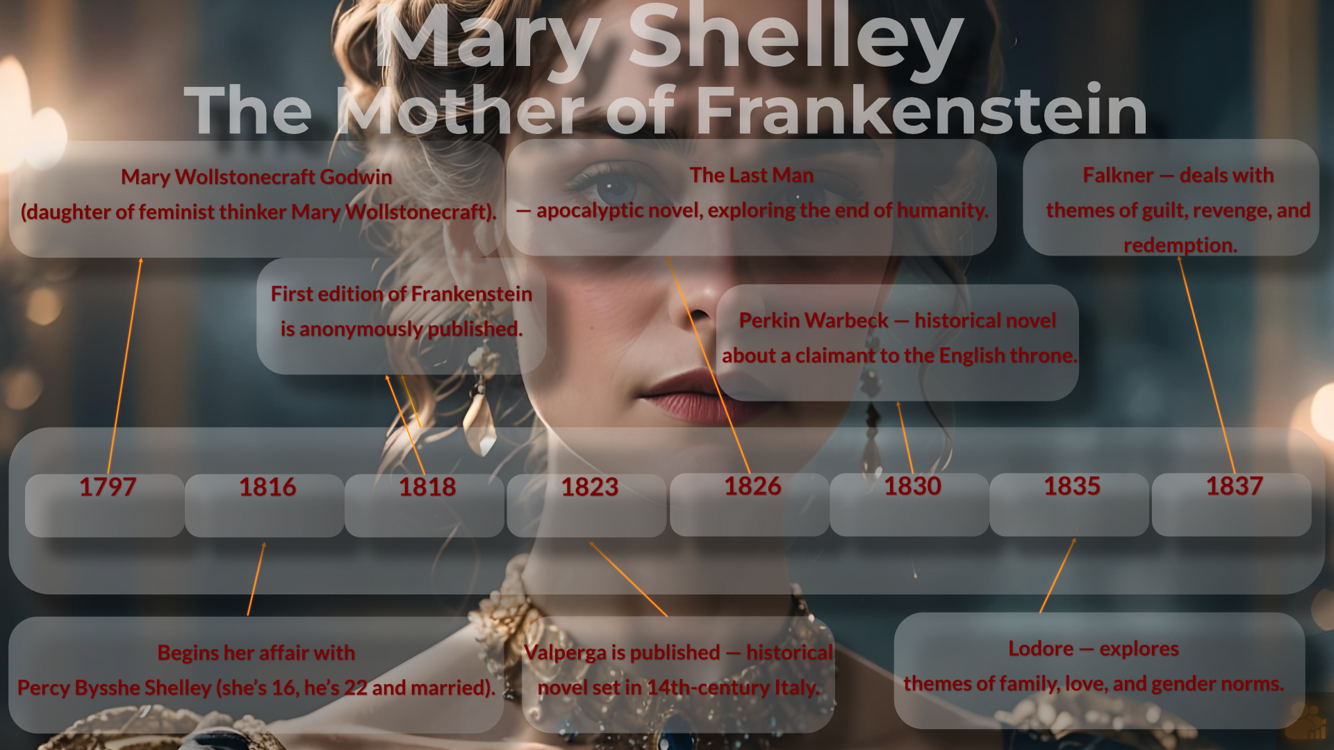
Mary Shelley (1797–1851) is best known for creating Frankenstein, but her career went far beyond one groundbreaking novel. Beginning her affair with Percy Bysshe Shelley at just 16, she went on to publish a series of works that explored themes of apocalypse, history, gender, and morality.
Highlights include Valperga (1823), a historical novel set in 14th-century Italy, The Last Man (1826), one of the earliest apocalyptic fictions, and Lodore (1835), which examined family and gender norms. Her final novel, Falkner (1837), tackled guilt, revenge, and redemption. Shelley’s timeline shows a writer continually wrestling with the boundaries of society, history, and imagination.
Source: Public domain works & literary scholarship
🌱 Phil’s Forecast: Accuracy of Punxsutawney Phil
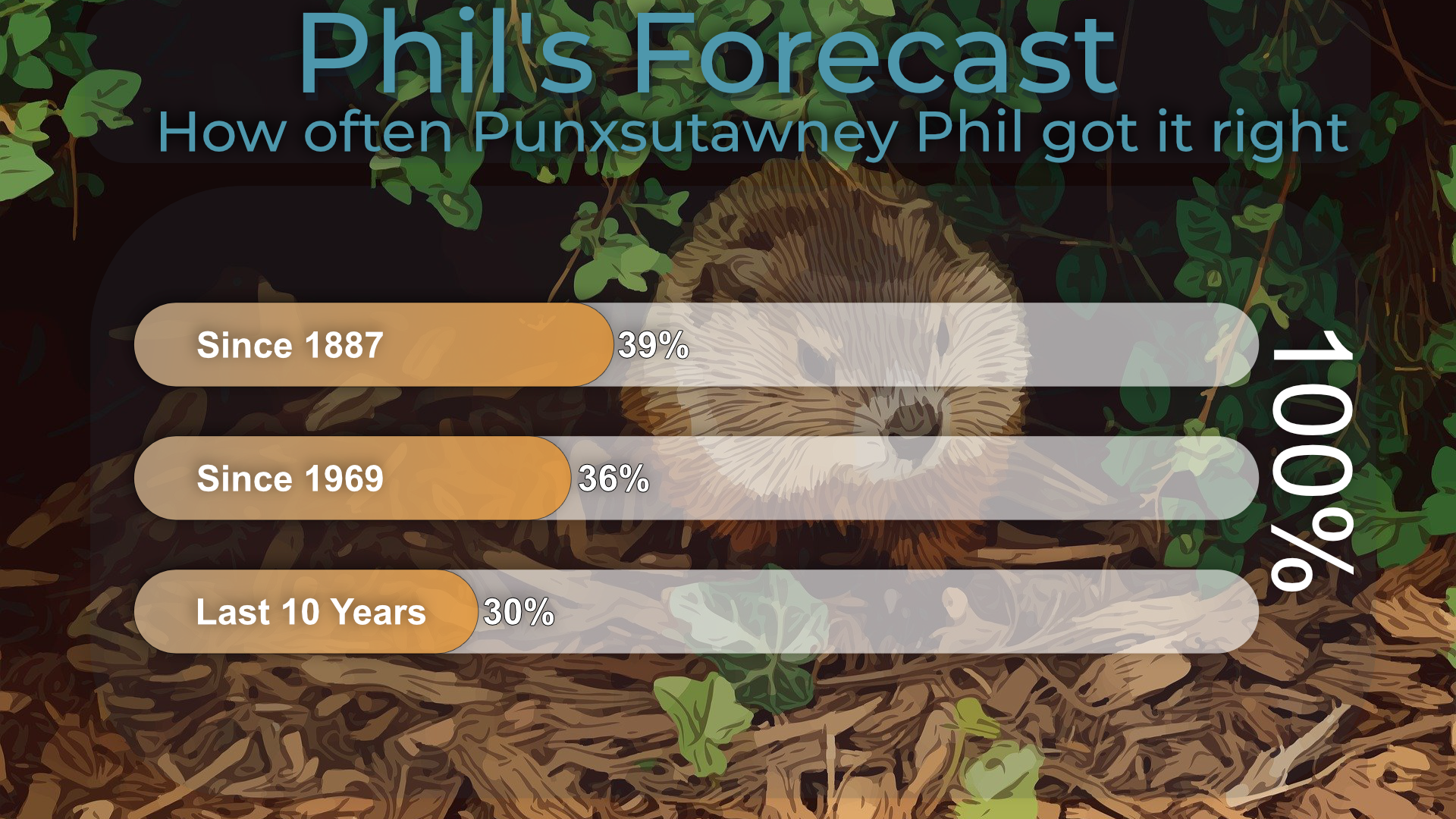
Punxsutawney Phil may be the most famous groundhog in the world, but his track record is shaky at best. Since 1887, his predictions have been right only 39% of the time. Narrow it to the modern era since 1969, and it slips to 36%. In the last decade, accuracy dropped further to just 30%.
It’s a reminder that tradition and data don’t always align — but the charm of Groundhog Day keeps Phil in the spotlight every February.
Source: National Centers for Environmental Information (NOAA)
🎬 Naomi Watts – A Career Through the Years
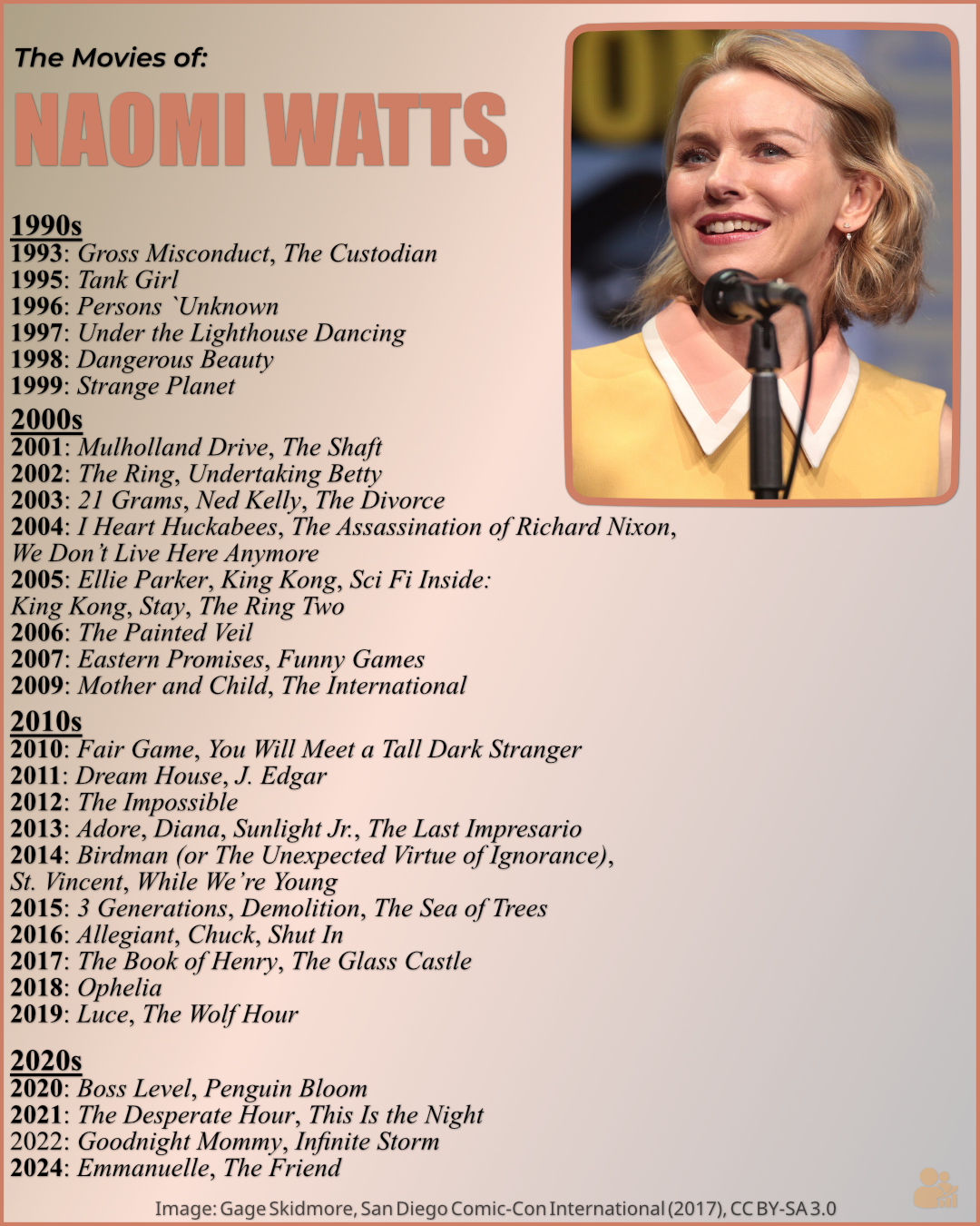
This visual tracks Naomi Watts' film career from the early 90s to the 2020s, showcasing a wide range of roles in movies spanning different genres. From iconic films like *Mulholland Drive* (2001) to more recent hits like *The Desperate Hour* (2021), her versatility and talent shine across decades of cinema.
Image Source: Gage Skidmore, San Diego Comic-Con International (2017), CC BY-SA 3.0.
📚 Book Types by Genre – Narrative vs. Knowledge
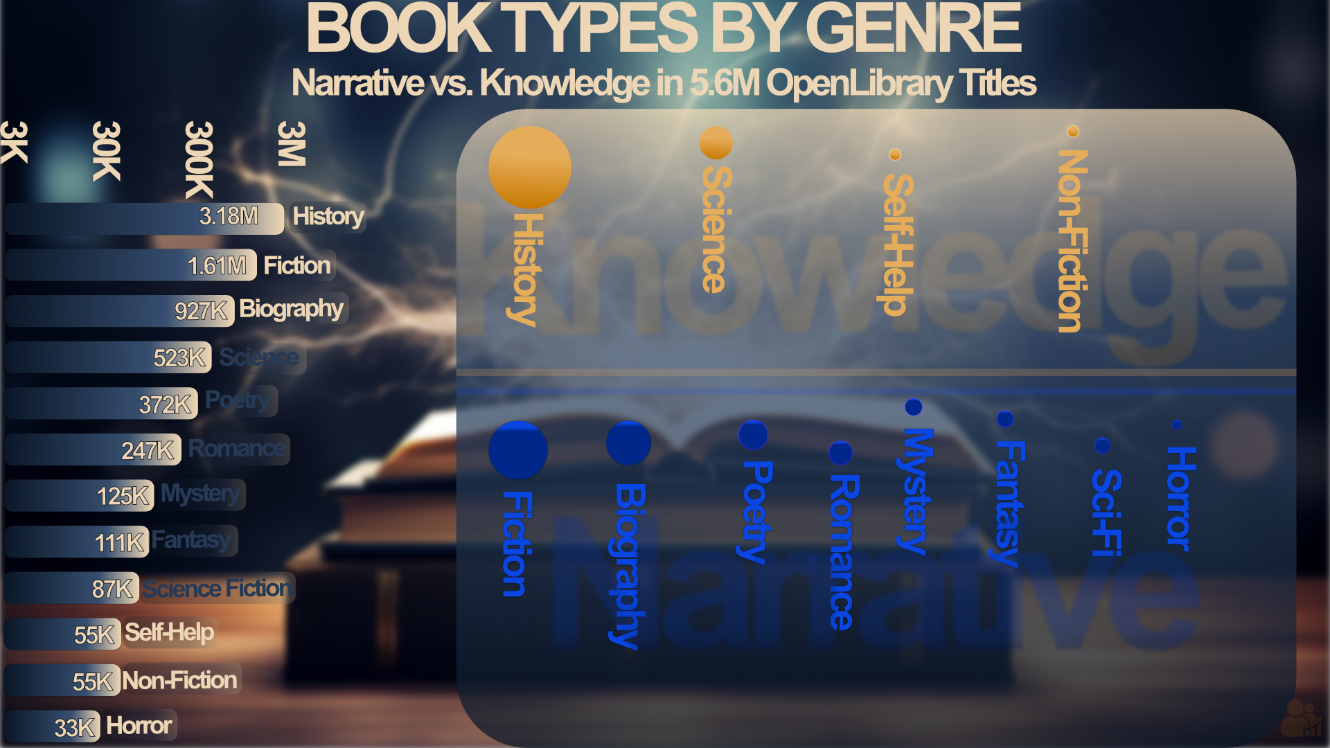
This chart visualizes the split between narrative genres like Fiction and Mystery, and knowledge genres like History and Science in a dataset of 5.6 million OpenLibrary titles. Narrative genres make up the majority, with History leading Knowledge genres by a significant margin.
Source: OpenLibrary 5.6M book dataset.
📖 How Pop Culture Rewrites the Dictionary
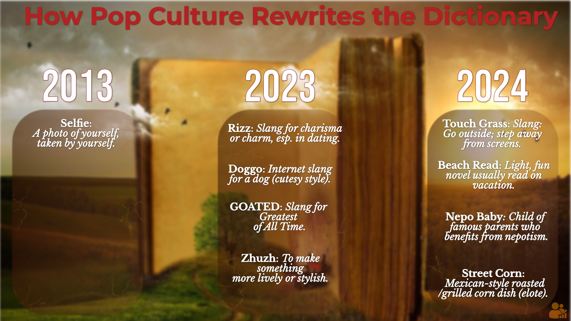
From Selfie (2013) to Nepo Baby (2024), everyday speech keeps reshaping the dictionary. Terms like Rizz, GOATED, and Touch Grass show how fast internet-born language jumps into mainstream recognition.
What starts as slang often becomes a cultural snapshot — one year’s memes are the next year’s definitions.
Source: Oxford English Dictionary & Merriam-Webster, 2013–2024.
🎬 The Movies of Spike Lee
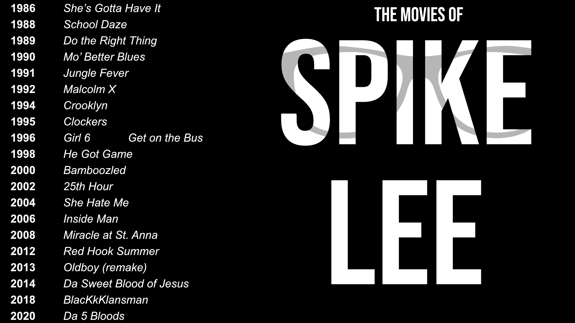
From She’s Gotta Have It (1986) to Da 5 Bloods (2020), director Spike Lee has built a body of work spanning drama, culture, and social commentary. This visual lays out his feature films across nearly four decades.
Source: Filmography of Spike Lee, compiled 2025.
🎤 Taylor Swift's Most Popular Songs on Spotify
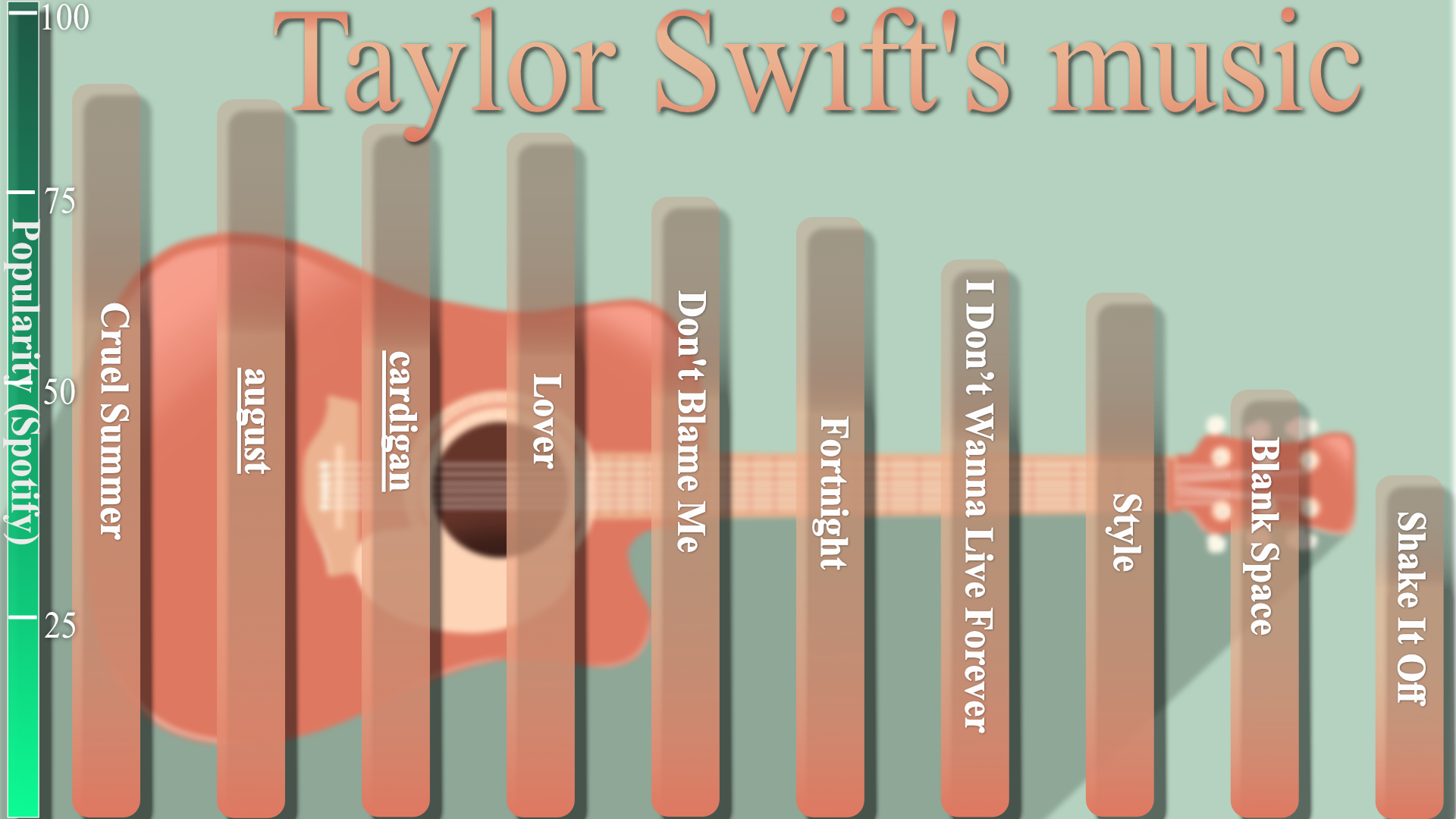
A Spotify popularity ranking of Taylor Swift’s top tracks as of August 14 2025, blending recent hits, deep cuts, and enduring fan favorites.
The chart reflects how streaming trends keep older singles like Cruel Summer and august at the top alongside newer releases, underscoring Swift’s rare ability to sustain multi-era chart relevance.
🎬 The Movies of Keke Palmer
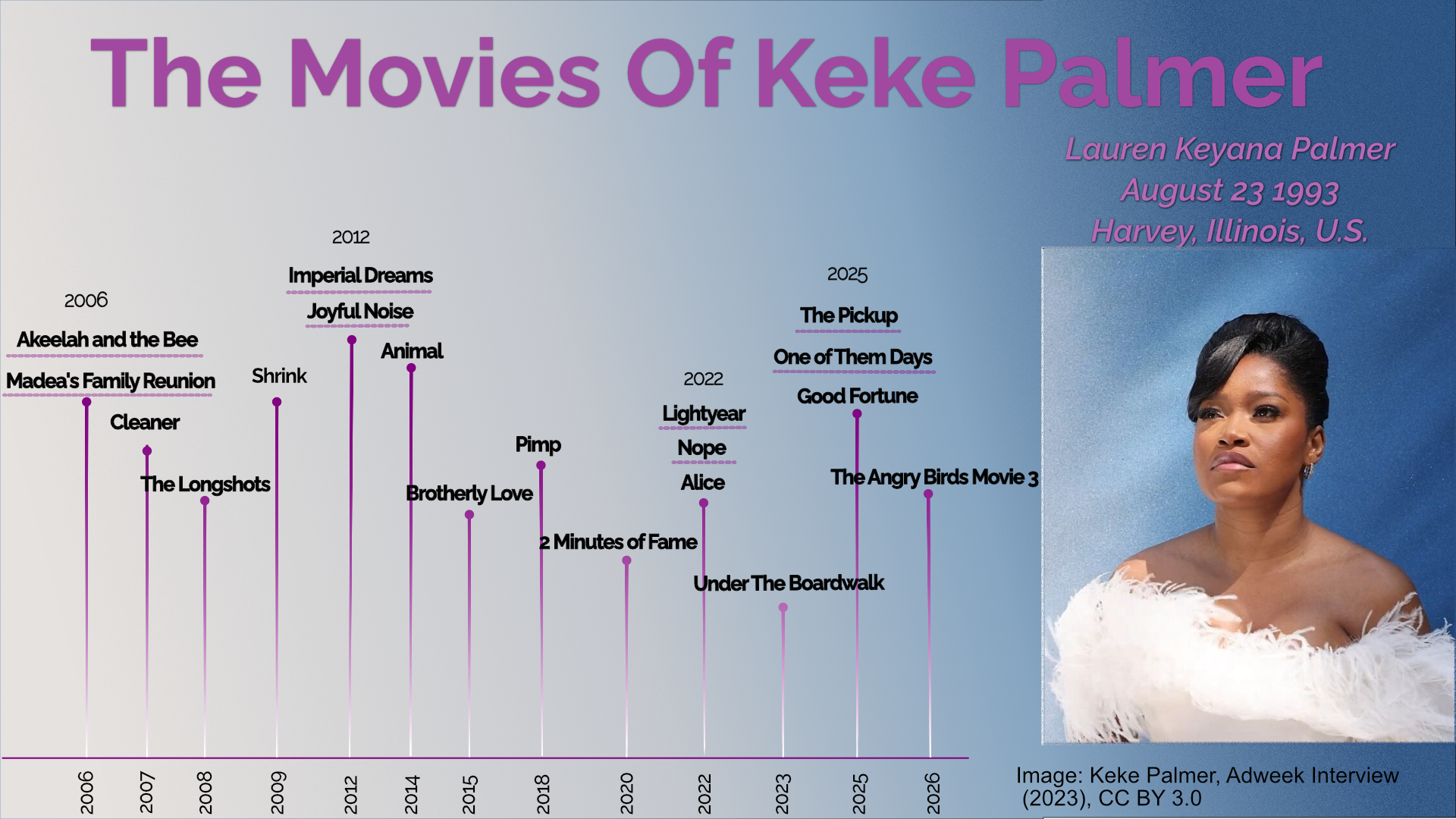
A career-spanning timeline of Lauren Keyana “Keke” Palmer’s filmography, from breakout roles in the mid-2000s to animated features and leading performances in recent years.
This chart highlights her versatility across genres and formats, with projects ranging from critically acclaimed dramas to blockbuster voice roles — and a slate of new films scheduled through 2026.
🎶 Top 60s — Today (Spotify Popularity)
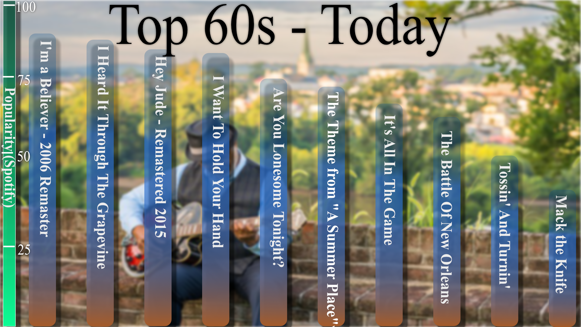
A quick nostalgia pass: ten iconic 60s tracks ranked by today’s Spotify popularity. Some standards still crush; others quietly fade.
Full notes in the pop culture story.
🍬 Top Flavor Boosters
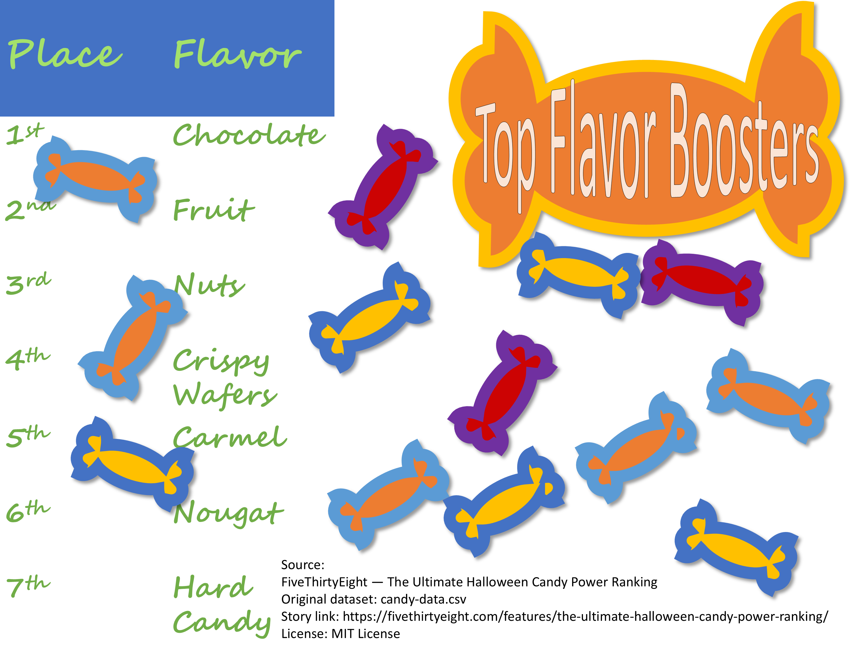
Which flavors make Halloween candy irresistible? According to FiveThirtyEight’s ultimate candy power ranking, chocolate leads the pack, with fruit and nuts following close behind.
Based on the FiveThirtyEight candy dataset (MIT licensed).
💥 Who Is the Strongest in the Marvel Universe?
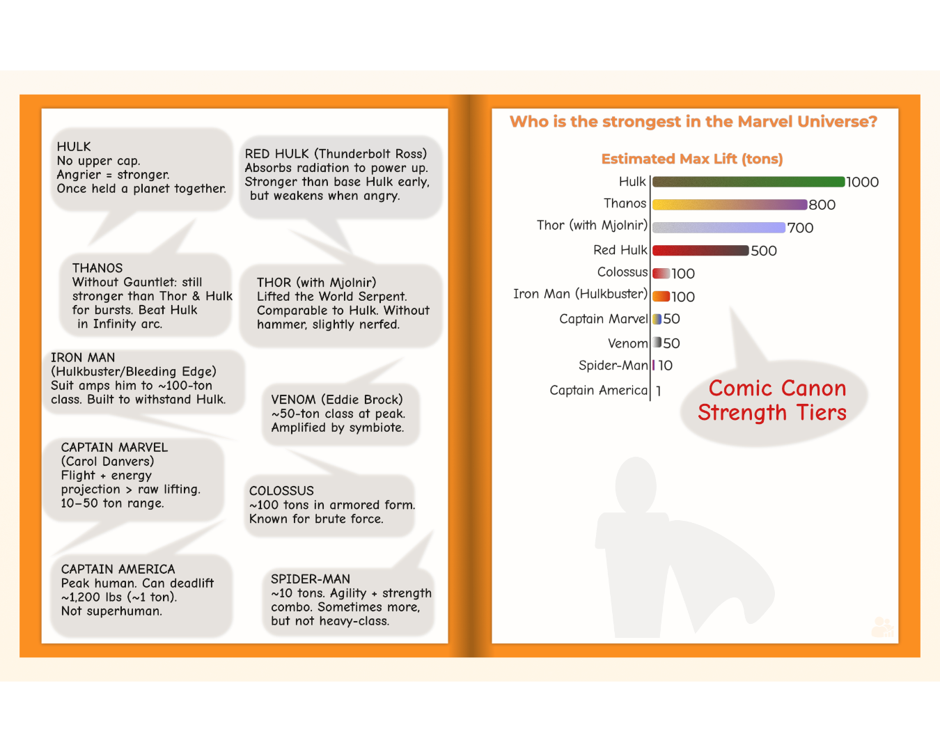
This chart compares the strongest Marvel characters by estimated lifting power. Hulk smashes. Data proves it.
🎬 Al Pacino: 55 Years of Cinema
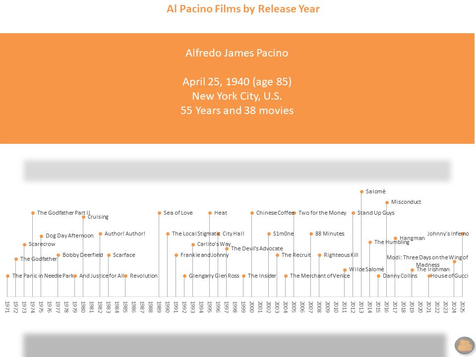
From The Godfather to House of Gucci, this chart tracks 38 films across five decades of cinema. Pacino didn't just age with Hollywood—he helped define it.
This visual is both tribute and timeline — a celebration of the characters, chaos, and charisma that made Pacino a generational force.
🎭 How Many Degrees Between Kevin Bacon?
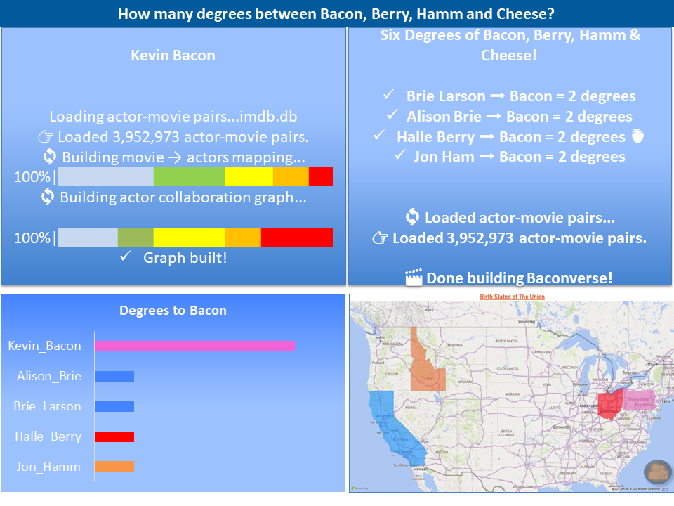
A playful look at the “Six Degrees of Kevin Bacon” game, mapping over 3.9 million actor–movie pairs to find connections. This snapshot highlights seven actors all just two degrees away from Bacon.
From Brie Larson to Keke Palmer, the results show how Hollywood’s web of collaborations makes “Bacon Numbers” surprisingly small — even for stars across different genres and eras.
🎥 George Takei – A Life on Screen
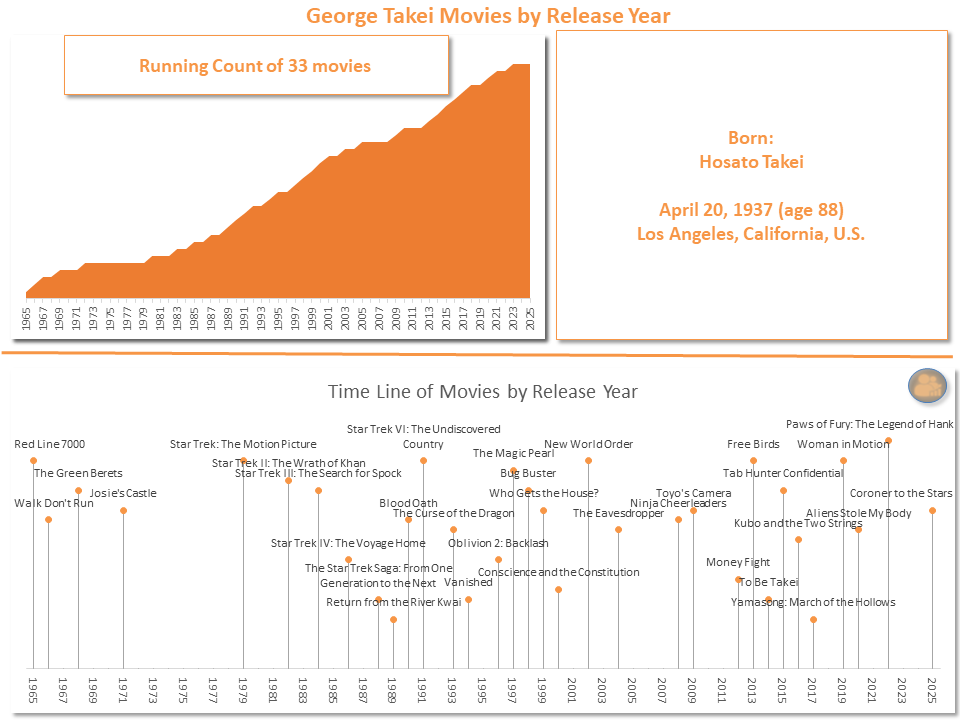
From Star Trek to animated features and everything in between — this visual tracks the 33-movie career of George Takei across six decades of cinema.
It’s not just a timeline. It’s a story of cultural presence, resilience, and how one man turned science fiction into personal truth.
🎞️ Stanley Tucci – 77 Films and Still Climbing
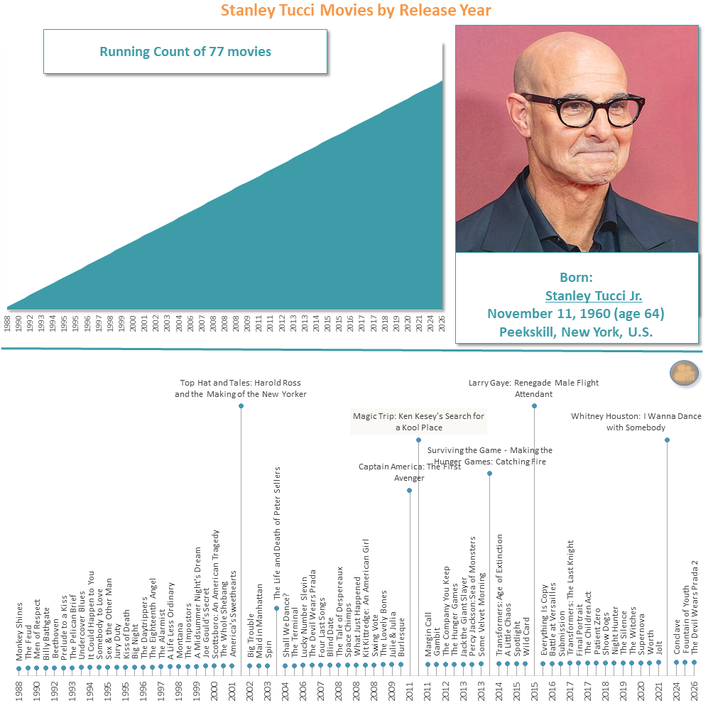
Stanley Tucci’s filmography is a masterclass in versatility — from scene-stealing side roles to powerful leads, across drama, comedy, and big-budget franchises.
This visual tracks 77 movie appearances over nearly four decades. For fans of character acting and quiet cinematic excellence, Tucci is the north star.
🍔 Wendy’s Growth Across America
From a single square-pattied dream to thousands of locations—this short animation shows the regional rise of Wendy’s in the U.S., with state-by-state store counts and a nod to the brand’s iconic milestones.
Download the full bundle: Wendy’s Timeline Project (.zip)
🔍 Top 7 Trending: Last 24 Hours (June 21–22)
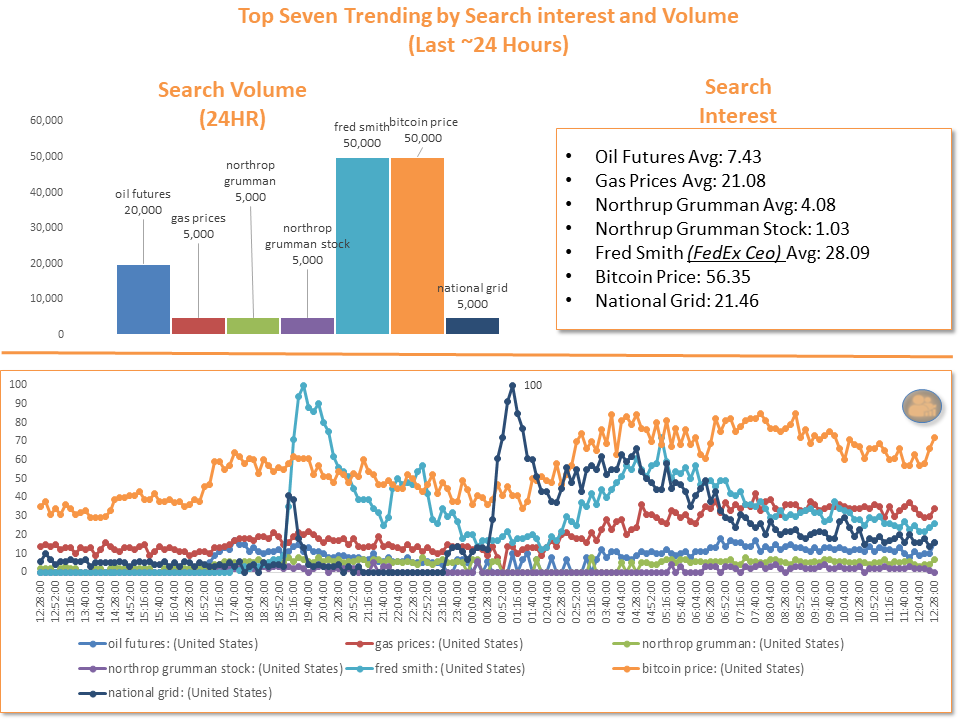
A real-time snapshot of U.S. search behavior. We compared volume spikes and consistent interest levels to find out who's catching attention and who's holding it.
🌟 Strawberry Moon Births by State

A playful take on natal astrology meets census logic. We plotted U.S. birth estimates during the full Strawberry Moon to reveal where these lunar legends are most concentrated.
Environment & Science
🌏 India & China: River vs. Land Cities by Population
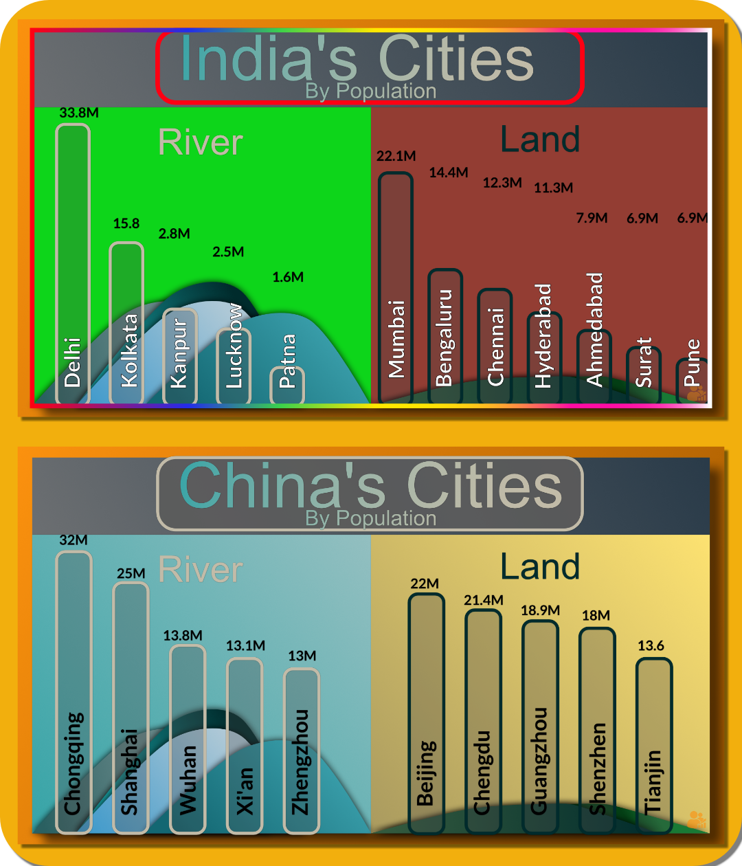
A side-by-side look at urban populations in India and China, separating river cities from inland land cities. Delhi and Chongqing top the charts for each nation, with river-based cities showing historically strong clustering in both countries.
These patterns reflect how geography still shapes megacity development, economic gravity, and the distribution of hundreds of millions of people.
Source: UN World Urbanization Prospects / Bamlytics
🧠 Intertwined Lives – Dementia Caregiving Outcomes
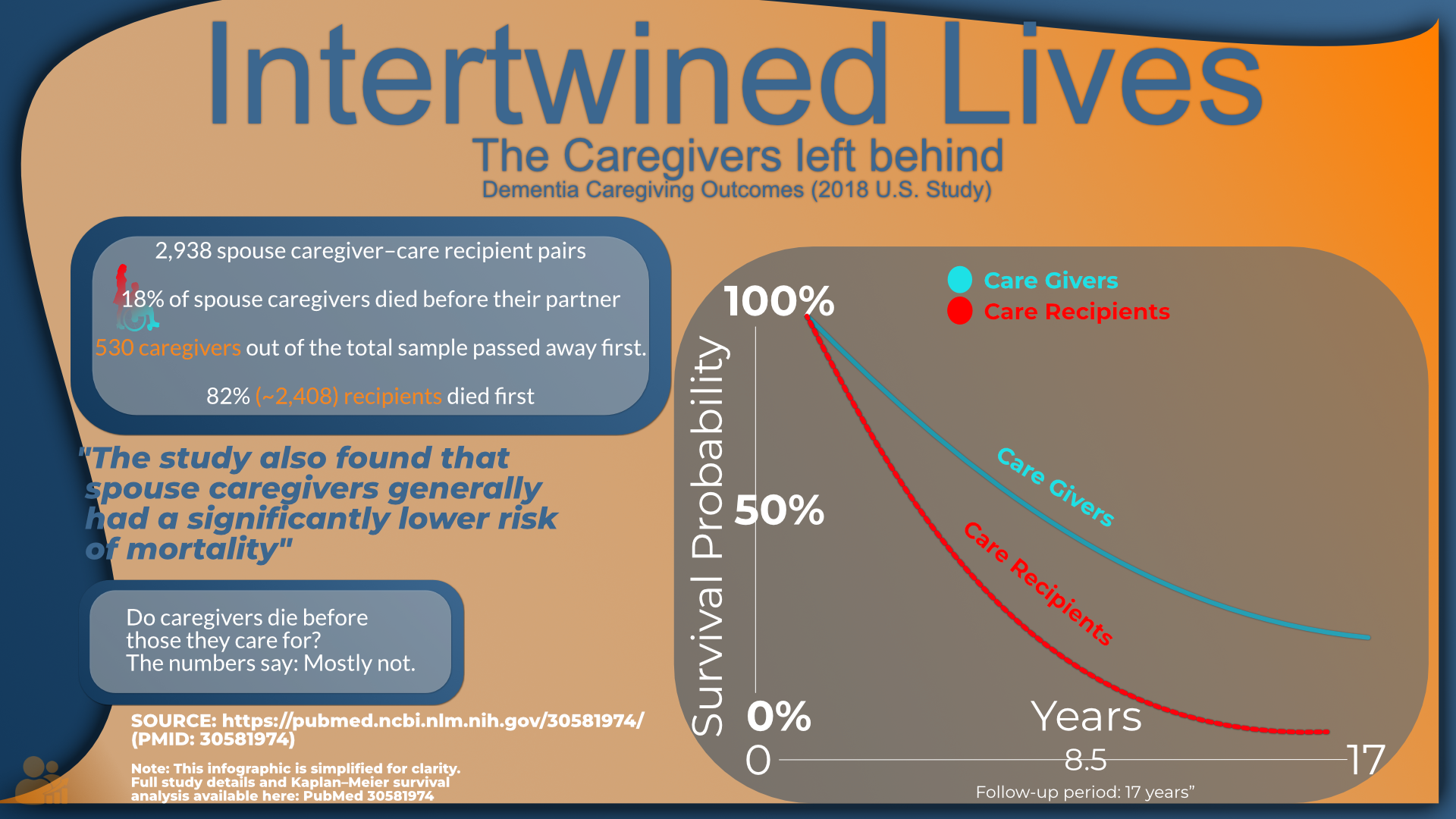
A visual summary of a U.S. study following 2,938 spouse caregiver–care recipient pairs over 17 years. Contrary to popular belief, only about 18% of spouse caregivers died before the person they cared for; the vast majority of early deaths were among care recipients.
The survival curves (simplified here) show caregivers generally had a lower risk of mortality than recipients across the follow-up period.
Source: PubMed PMID 30581974. Full text: pubmed.ncbi.nlm.nih.gov/30581974/
Note: This infographic is a simplified interpretation for clarity; see the linked paper for full methods and statistics.
🪶 Hummingbird vs. Albatross – Design Extremes
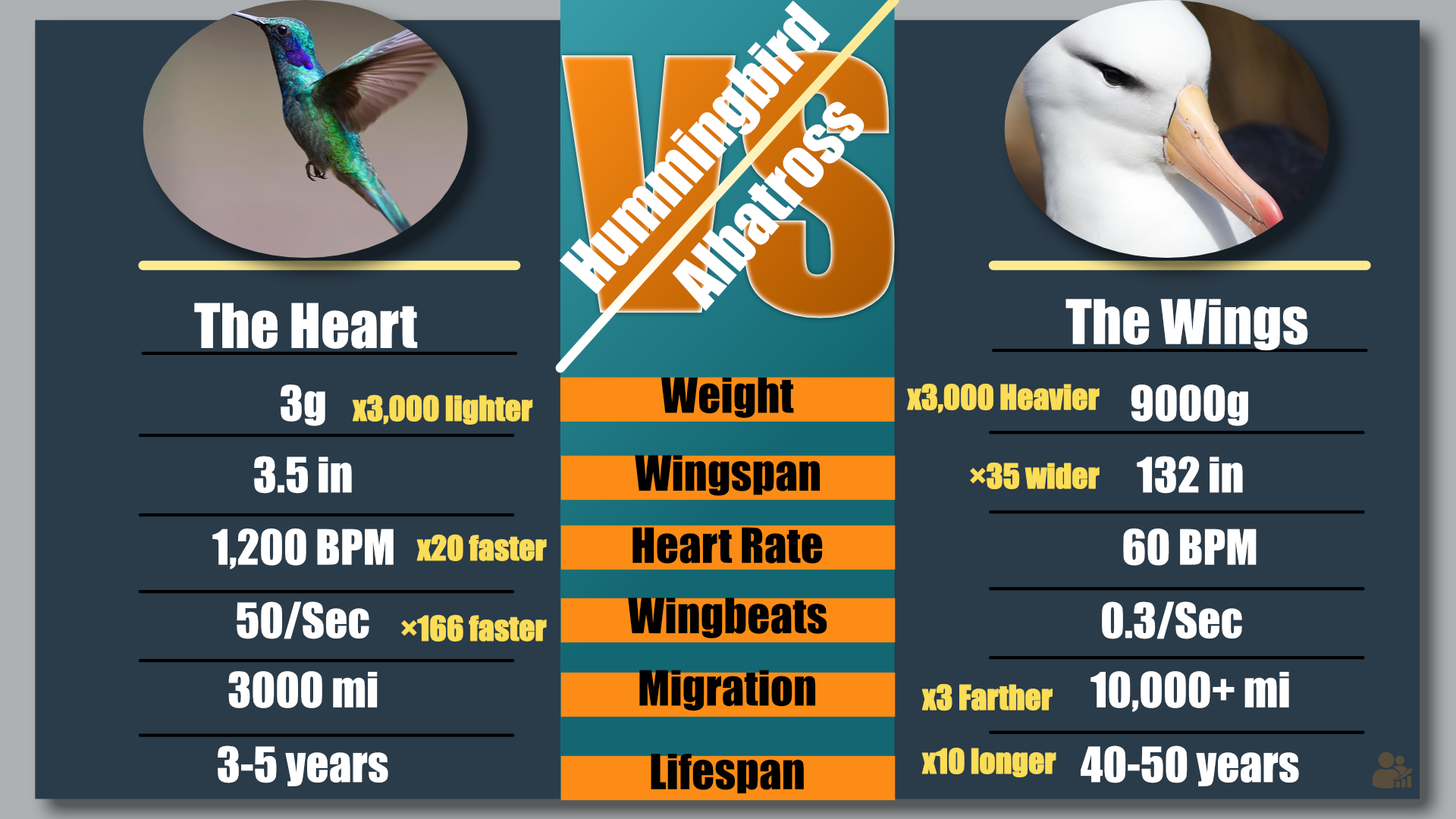
A side-by-side comparison of two very different champions of flight. The hummingbird is all heart and high energy: 3 grams, 1,200 BPM, 50 wingbeats/sec. The albatross is built for endurance: 9 kg, 132 in wingspan, 40–50 year lifespan.
Together, they show nature’s range of solutions to the same problem: staying airborne.
Concept and design: Bamlytics Project Studio, 2025.
🌊 When Earthquakes Make Waves – Magnitude vs Tsunami Run-up Height
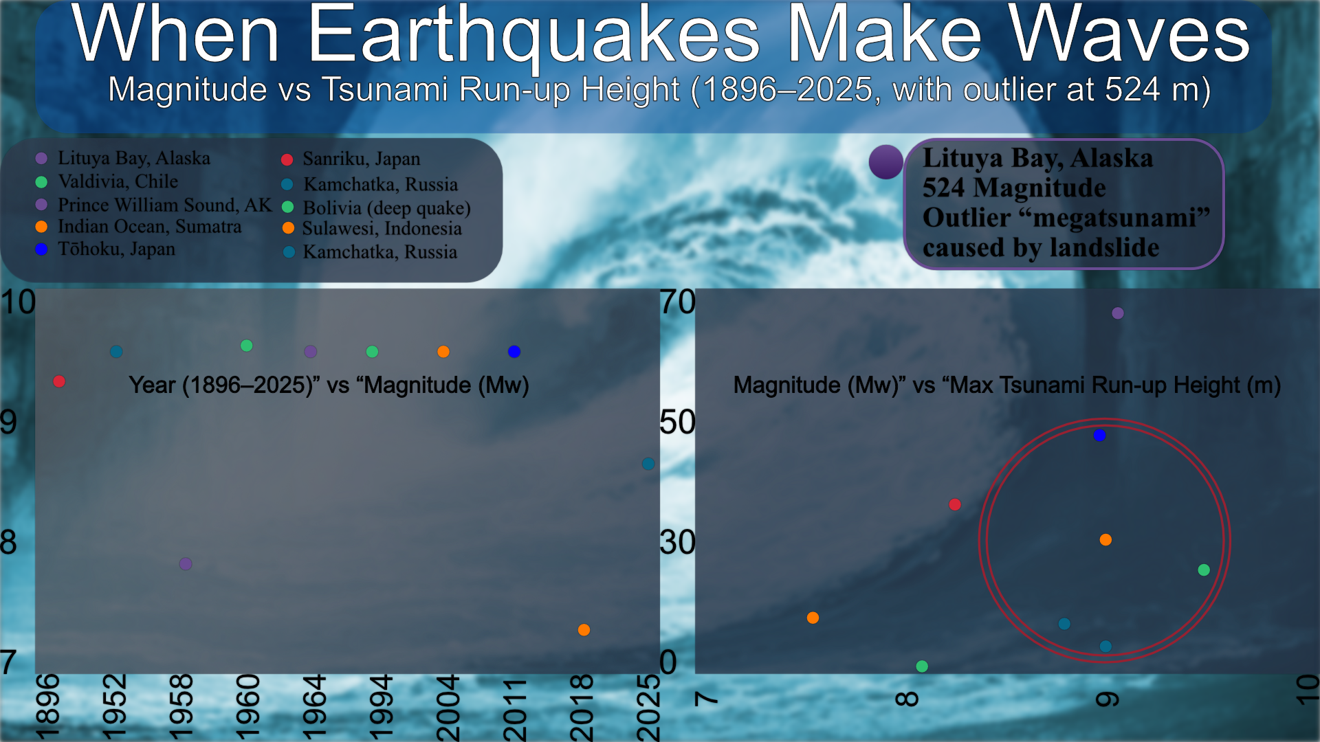
This visualization explores the relationship between earthquake magnitude and the resulting tsunami run-up height, based on data from major events between 1896 and 2025. The chart includes an outlier from the Lituya Bay, Alaska event (1958), where a megatsunami reached an unprecedented 524 meters, driven by a landslide rather than an earthquake.
Source: Tsunami and Earthquake Data (1896-2025).
🦜 The Atlantic Puffin – High Numbers, High Decline
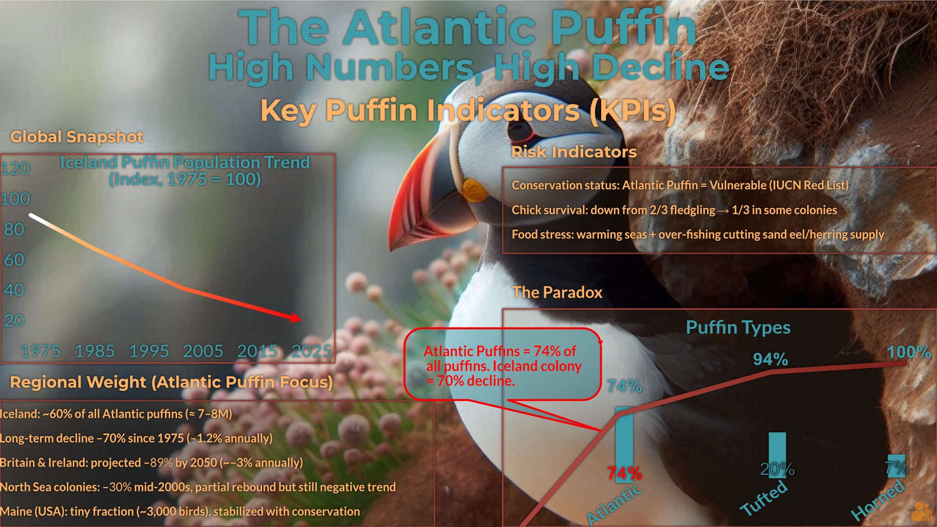
This visual explores the decline of the Atlantic Puffin population, with a focus on the Icelandic colony, which has seen a 70% drop since 1975. The chart highlights risk indicators, including warming seas and overfishing, which stress food supplies for puffins. While populations remain high in some regions, the overall trend points to a vulnerable species with conservation efforts underway.
Source: IUCN Red List and Regional Puffin Population Trends.
🍫 Average Sugar per Serving
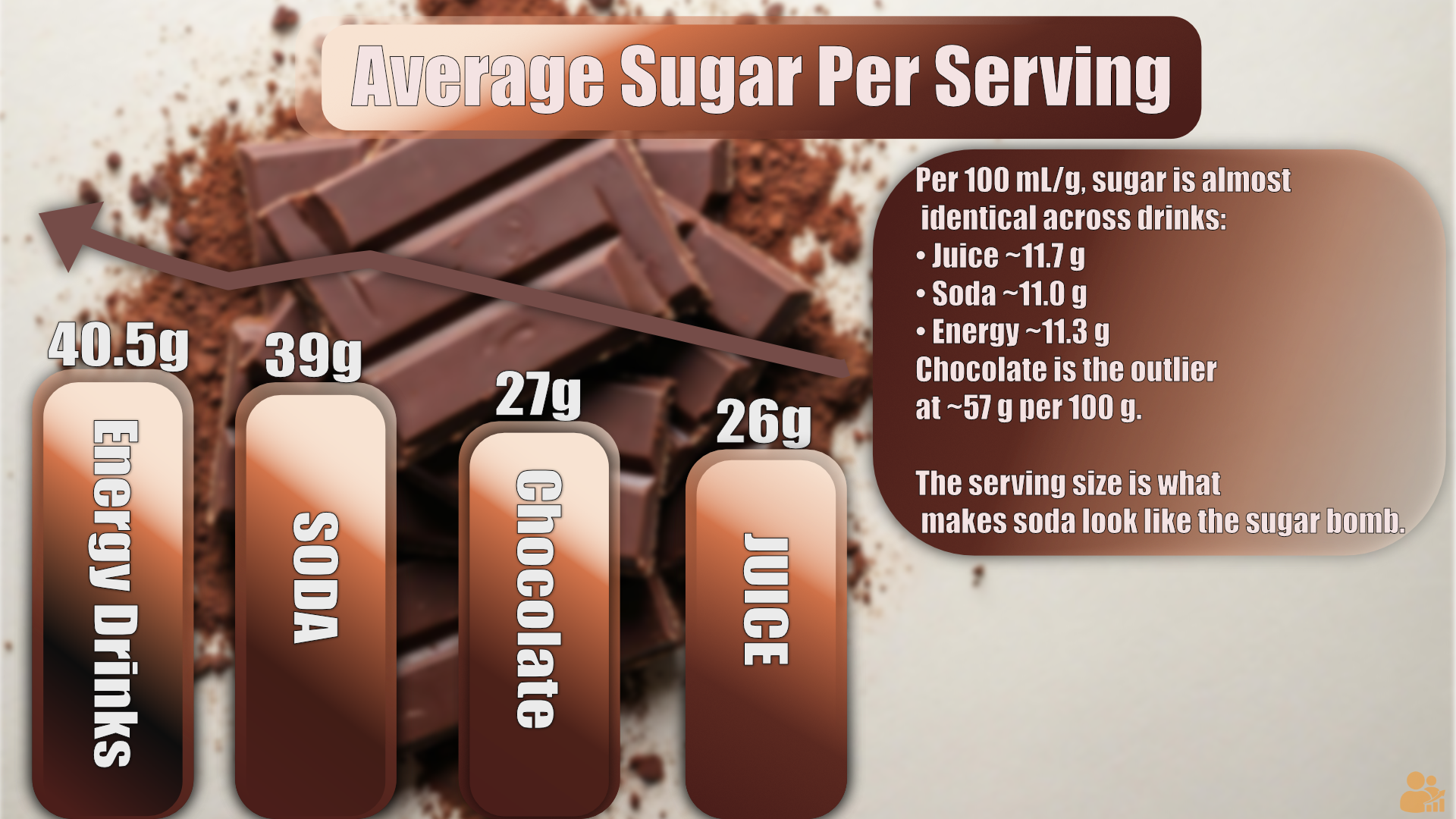
Per 100 ml/g, sugar levels are nearly identical across drinks — around 11 g. What makes soda and energy drinks look like sugar bombs is the larger serving size, not the sugar density.
Chocolate is the outlier, with ~57 g per 100 g — though smaller portions mask how concentrated it really is.
Source: Nutrition data compiled, 2025.
🌱 From Bean to Bland: The Journey of Tofu
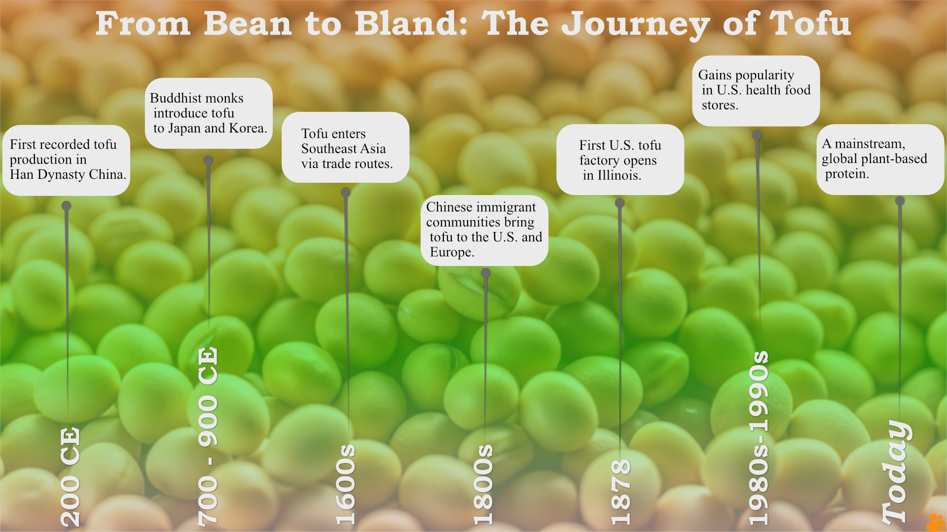
A historical timeline tracing tofu’s 1,800-year journey from its origins in Han Dynasty China to its spread across Asia, introduction to the West, and eventual rise as a mainstream plant-based protein.
Once a regional staple, tofu has evolved into a global food trend, fueled by cultural exchange, health food movements, and the modern push toward sustainable diets.
🦁 Lions — Key Moments in Preservation History
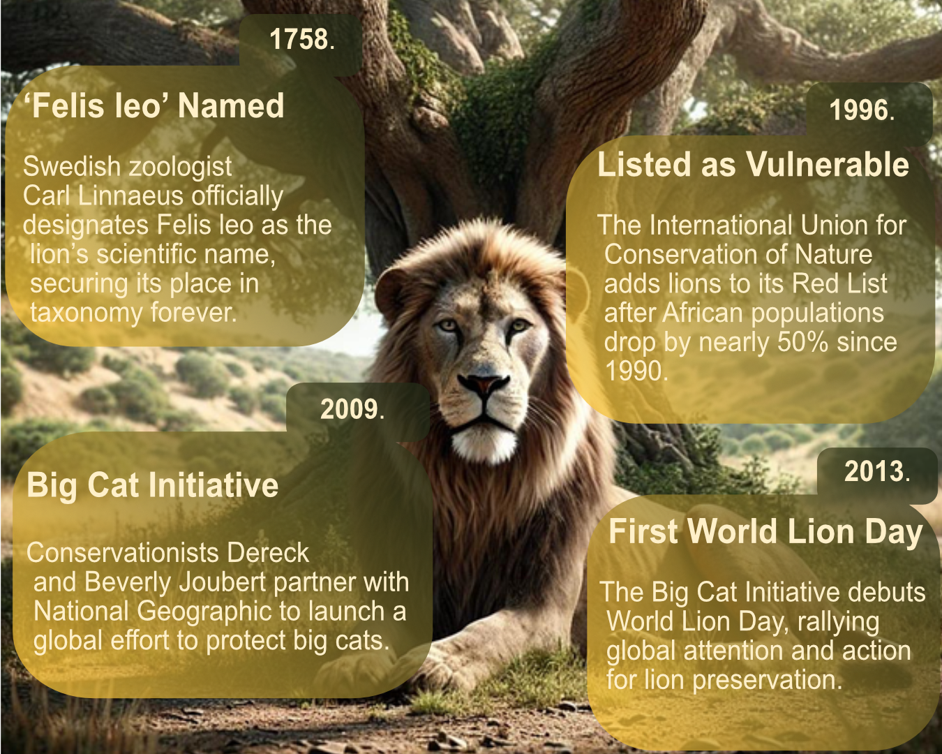
A concise timeline of lion conservation and taxonomy milestones, from Carl Linnaeus’s 1758 designation of Felis leo to modern global awareness efforts.
These moments trace how lions went from iconic species to conservation priority — and how international partnerships and awareness campaigns now work to secure their future.
🐅 Tiger Populations – Top 10 Countries
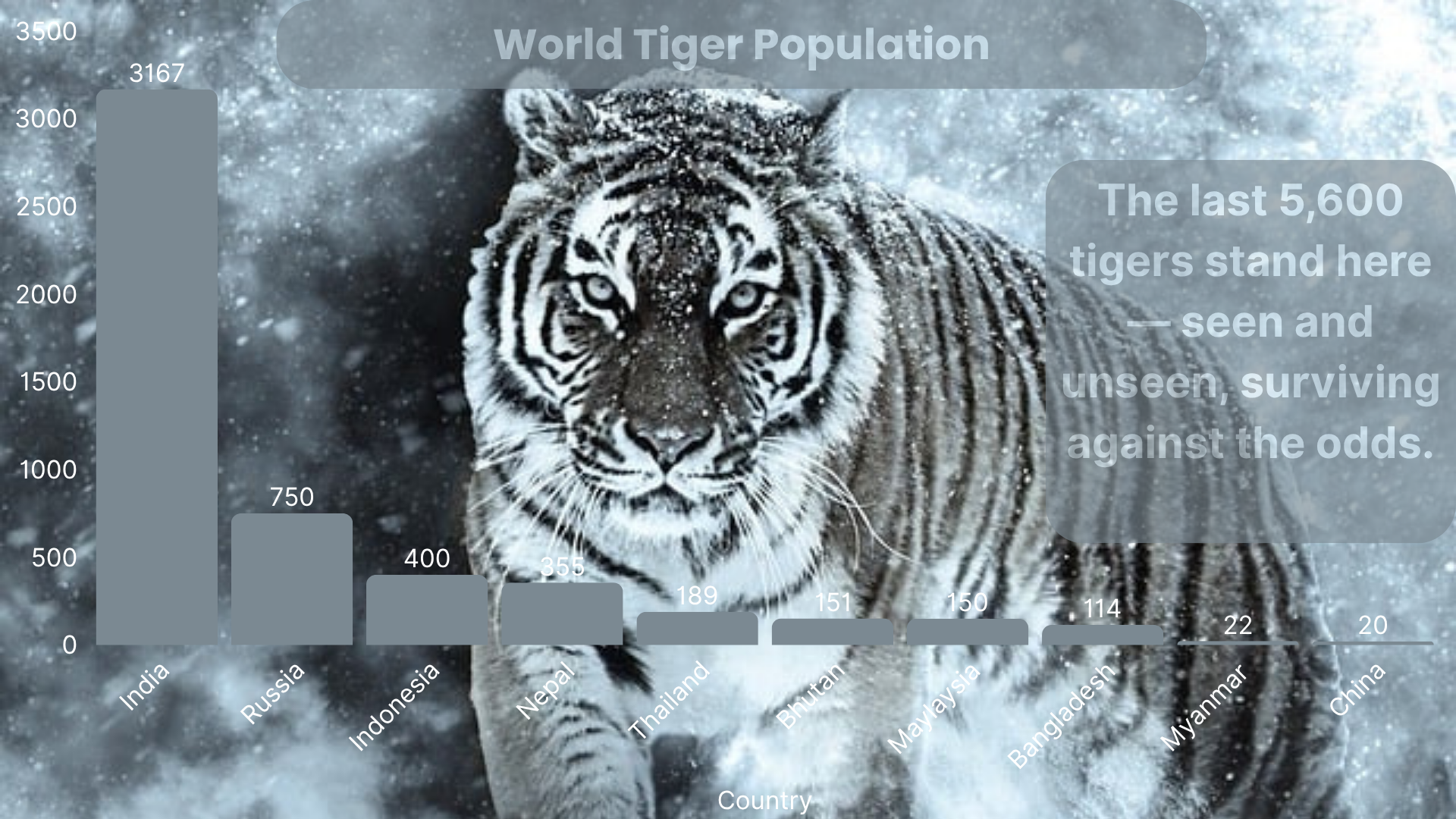
Only 5,600 tigers remain in the wild — three‑quarters live in India, while smaller populations fight for survival across Russia, Indonesia, and beyond.
🐝 Bee Colony Loss (2023–2024)
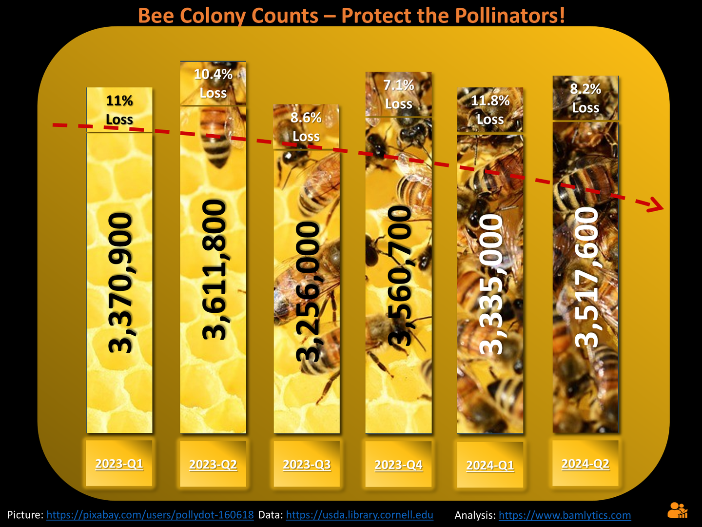
Pollinators in peril: quarterly bee colony counts reveal consistent losses of 7–11%, threatening ecosystems and food supply chains.
👩⚕️ Future Nurse Demand (2022–2031)
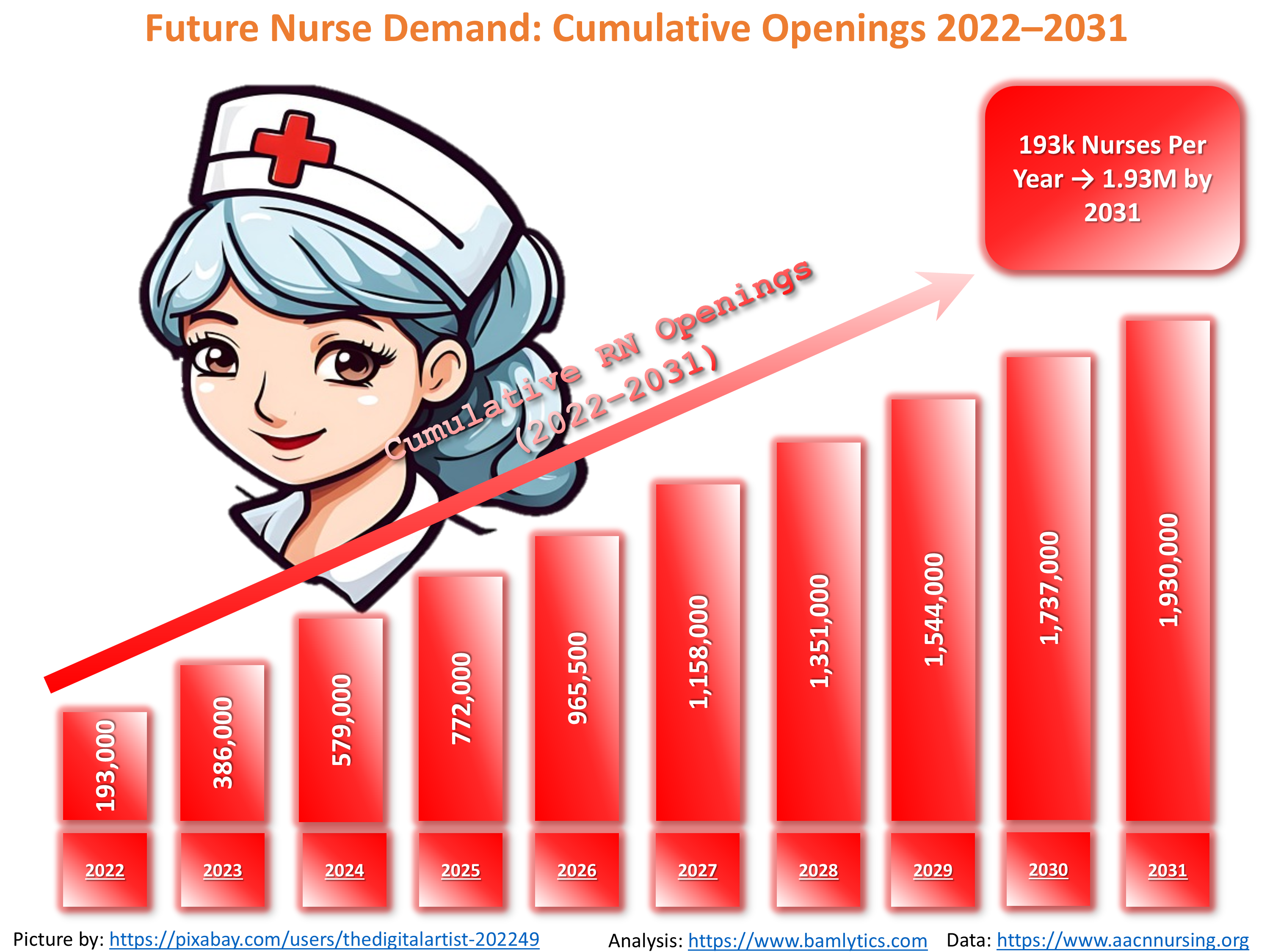
By 2031, the U.S. will need nearly 2 million new nurses — that’s 193k new RNs graduating every year to meet healthcare demands.
🧂 Salty by Nature
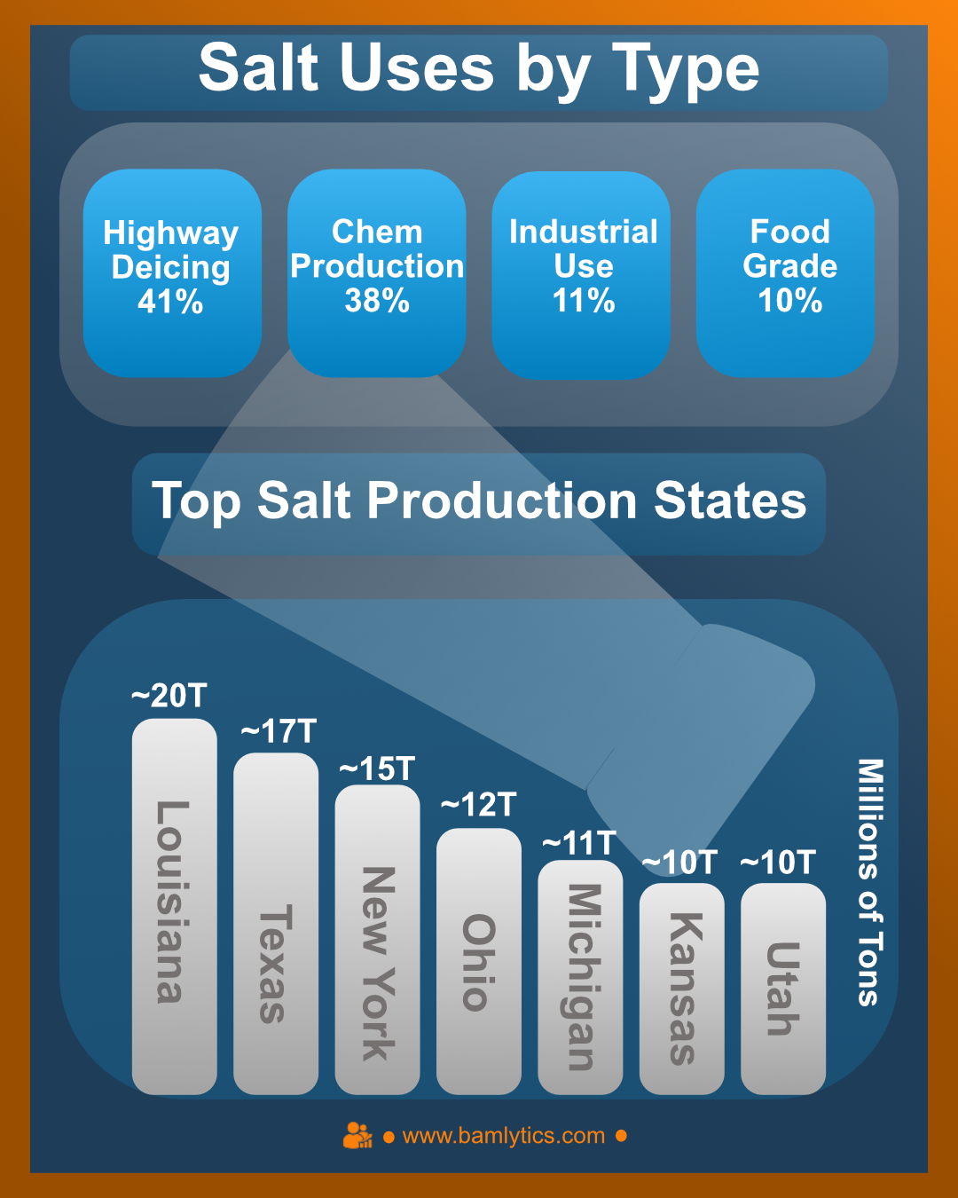
Louisiana leads U.S. salt production with ~20 million tons, most of it headed for icy highways and chemical processes. Food-grade salt? Just 10% of the total.
Data compiled from U.S. geological and industrial sources; volumes approximate annual production.
🥑 Avocado Economics
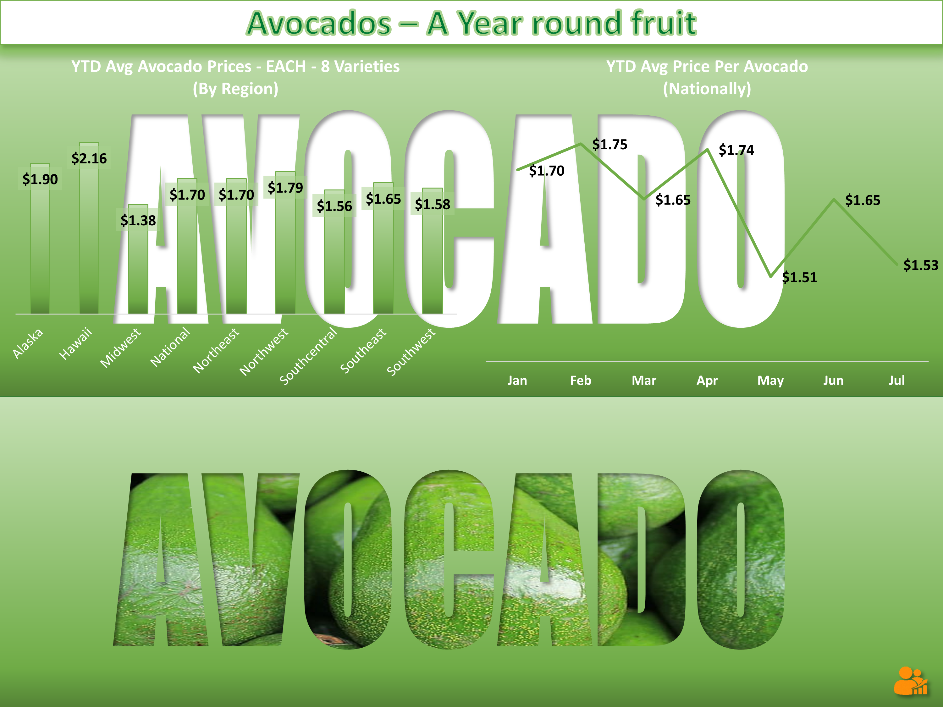
Data never looked so green. This Bamlytics visual dives into seasonal trends and pricing patterns in everyone's favorite toast-topper.
⚡ Power by Source
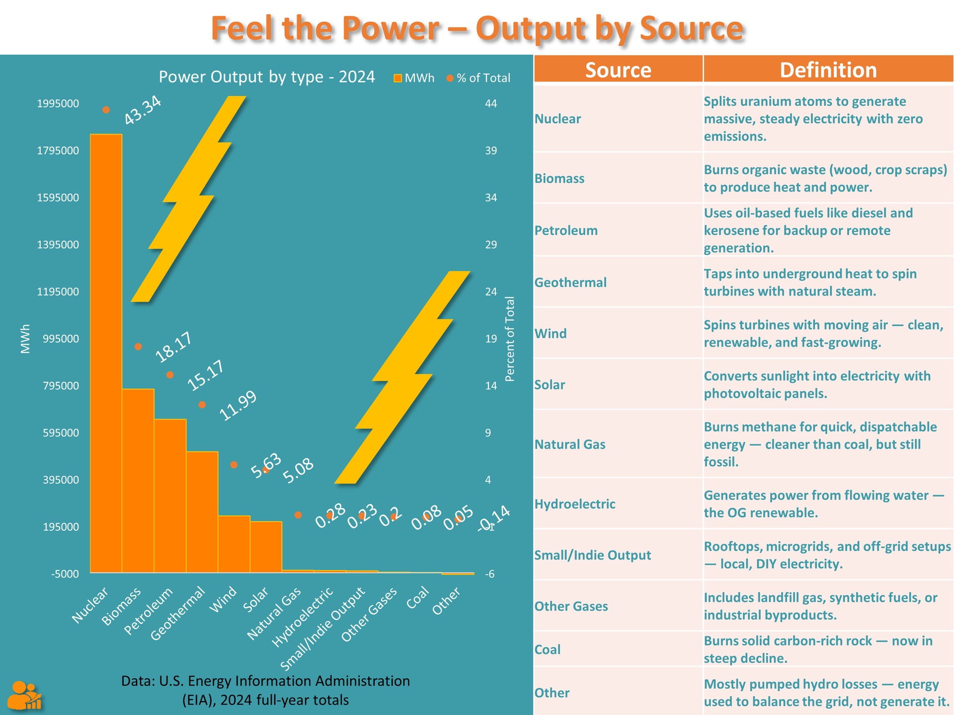
Not all watts are created equal. This chart compares the average cost of power generation across energy types, from coal to wind to nuclear.
🎃 Pumpkin Season Prep
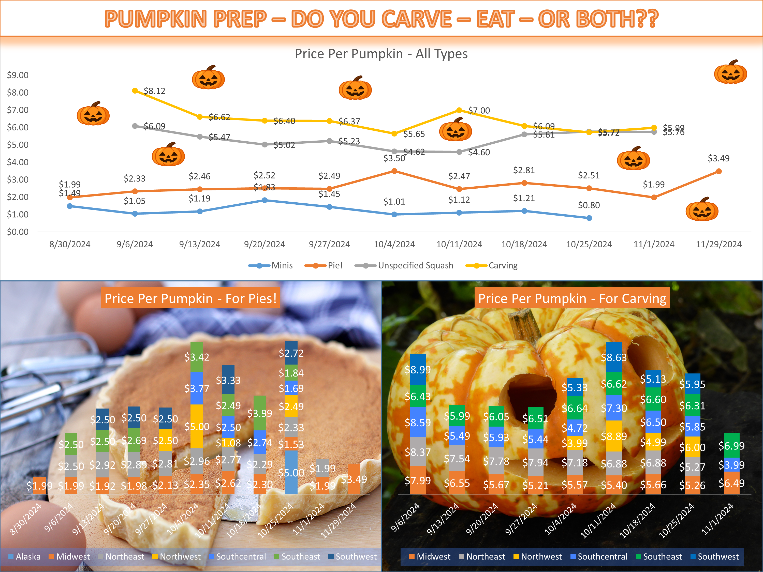
Bamlytics delivers a cozy autumn breakdown of how pumpkin-spiced products infiltrate the American psyche—and palate.
🍣 Sensei vs. Chef
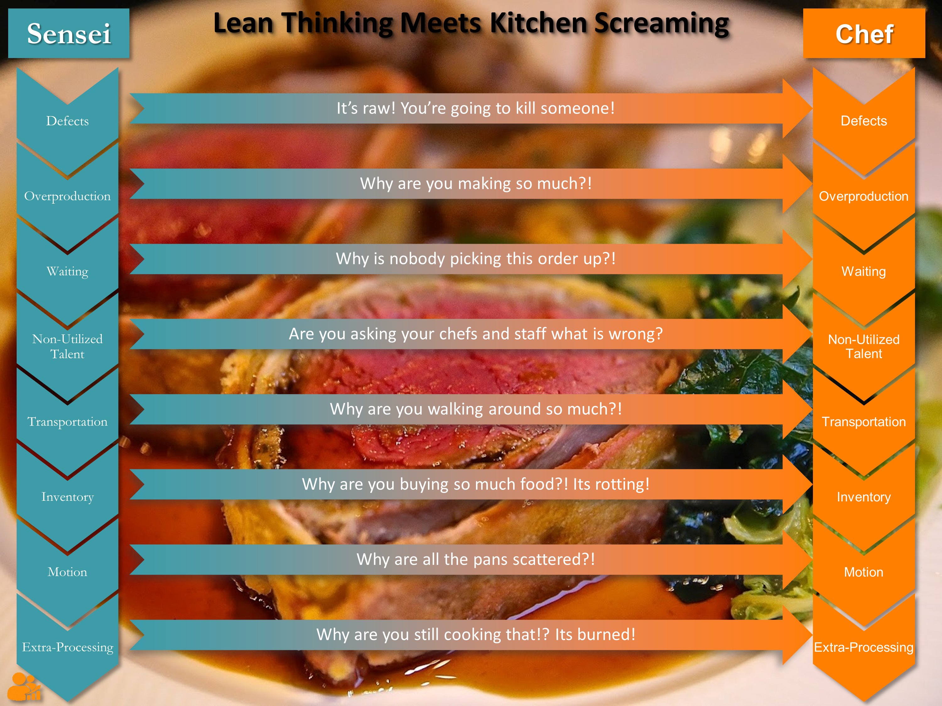
A playful yet pointed visual that contrasts corporate lean philosophy with real-world frontline adaptation—who's really running the kitchen?
🧠 Mental Health Recovery – 2020 to 2024
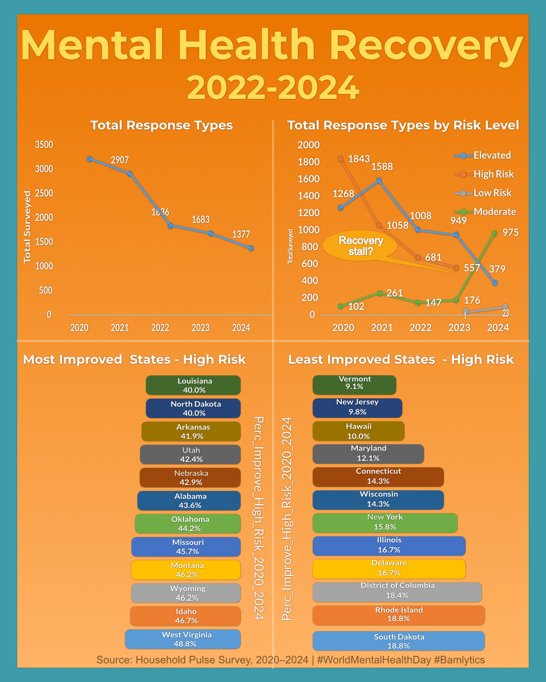
Based on millions of survey responses from the Household Pulse Survey, this visual explores the rise — and gradual fall — of elevated mental health risk across the U.S. from 2020 to 2024.
While the national trend improved sharply post-2021, signs of a plateau are showing in 2024. States like West Virginia, Nevada, and Arkansas made major gains — while Vermont and New Jersey lagged behind.
🐶 Shelter Stats – Dogs, Data, and a Dash of Hope
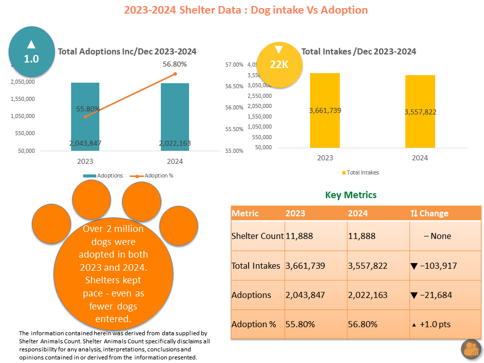
Over 2 million dogs were adopted in both 2023 and 2024 — even as fewer dogs entered U.S. shelters. This chart highlights the balance shelters struck, with intake volume dropping but adoption rates rising.
Data can tell stories of rescue too. From total volume to shelter counts to percentage shifts, this snapshot is proof that compassion and capacity stayed strong.
🕊️ Nobel Peace Prize Timeline (1901–2024)
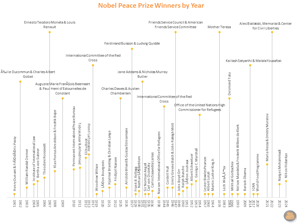
A century of global recognition — from Bertha von Suttner’s 1905 win to Narges Mohammadi’s 2023 fight for women’s rights. This timeline marks each Nobel Peace Prize year with a name that shaped the world.
Peace isn’t a moment. It’s a pattern. This visual was built to honor that pattern — one name, one year, one hope at a time.
📍 U.S. Census Gender Trends — And Why I’d Relocate to Seattle
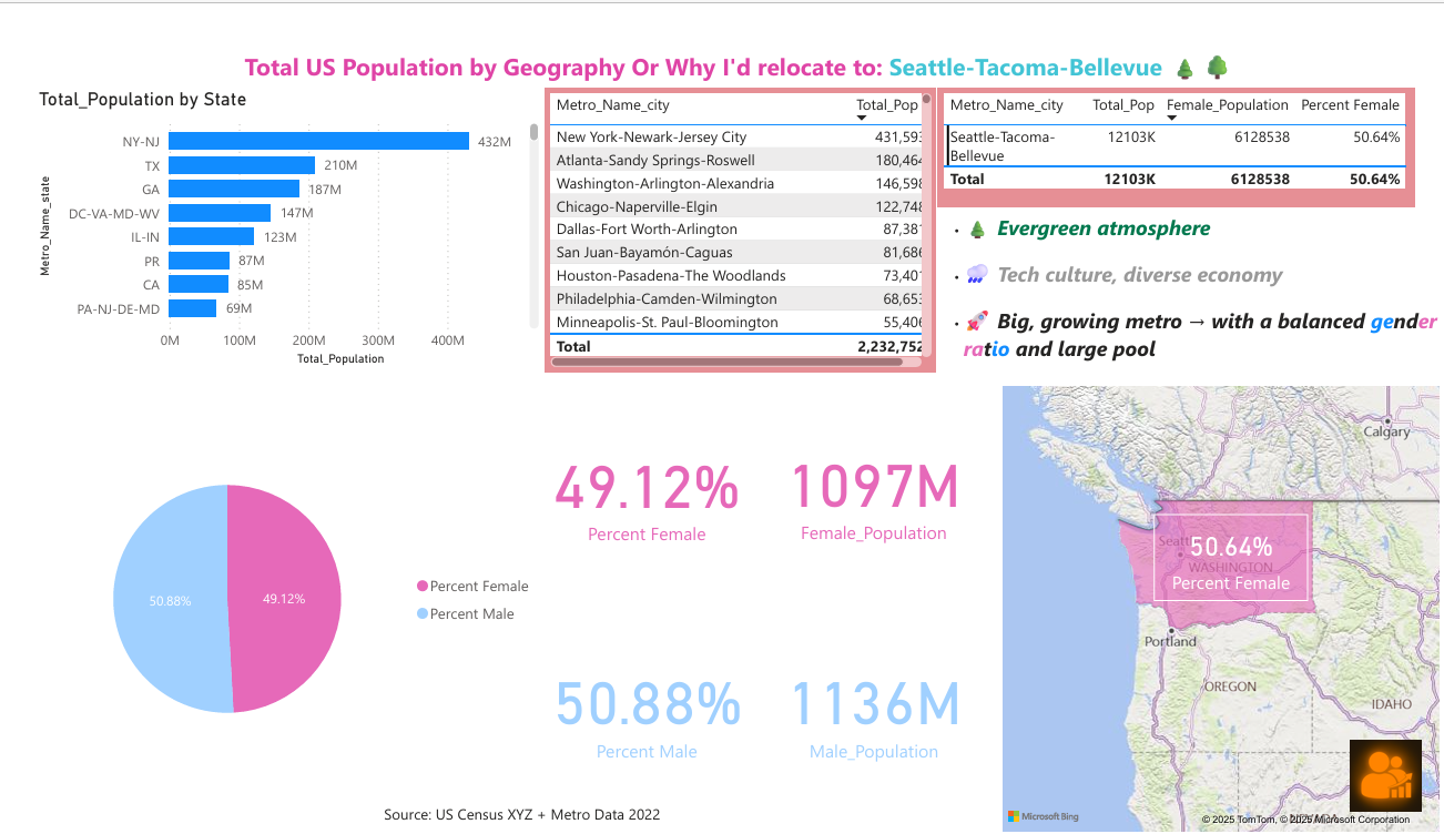
This dashboard dives into metro-level gender ratios across the U.S. — with a soft spotlight on Seattle-Tacoma-Bellevue as a balanced, thriving option for relocation.
From evergreen vibes to equal-opportunity dating odds, Seattle just might be the Goldilocks metro for modern life: not too big, not too skewed, and full of potential.
Sports & Culture
🚩 Colors of the World’s Flags
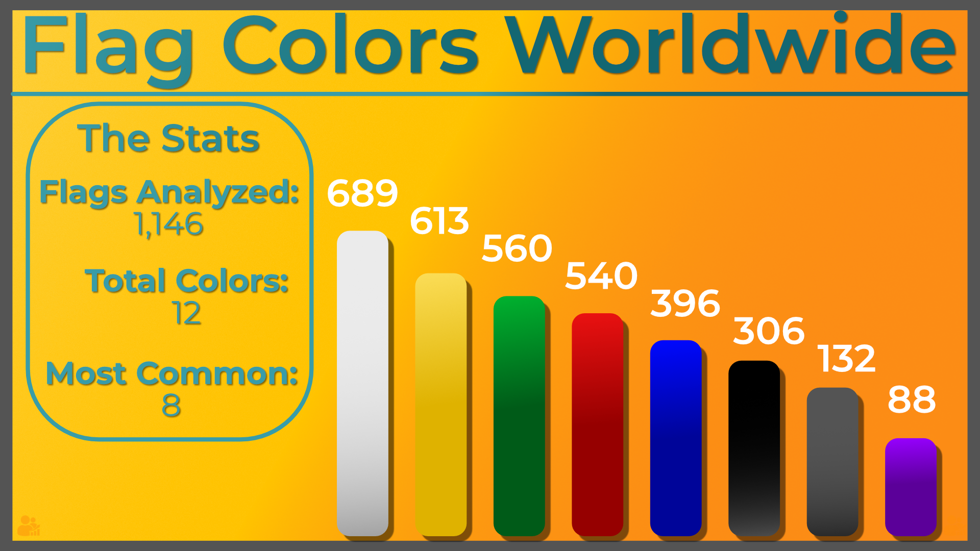
White dominates global flags, appearing on nearly 700 designs, followed by yellow and green. Purple? Rare — just 88 flags feature it.
Analysis of 1,146 flags and 12 total colors across national, regional, and cultural emblems.
🍽️ Michelin Star Map – U.S. Restaurant Guide
An interactive pinpoint map of Michelin-rated restaurants across the U.S., using official location data and live geocoordinates. Filter by location, zoom in by city, and use the embedded legend to see 1⭐, 2⭐, and 3⭐ rankings in style.
Michelin’s prestige is global — but this map makes it local. Use it to plan a trip, compare culinary hotspots, or just see who’s plating stars.
Download the full data and map bundle: Michelin Stars U.S. Bundle (.zip)
🏀 BamPick’Its: My Dream Team Based on 2024 NBA Stats
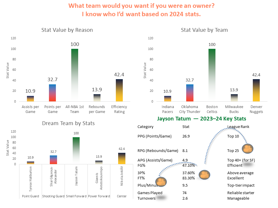
If you were an NBA owner, who would you pick? This visual builds a dream team based entirely on 2024 stat leaders — not hype. From Tyrese Haliburton’s assists to Tatum’s league-topping value, these picks make the case with data.
This is how I'd draft. No biases. No drama. Just value per position and numbers that back it up.
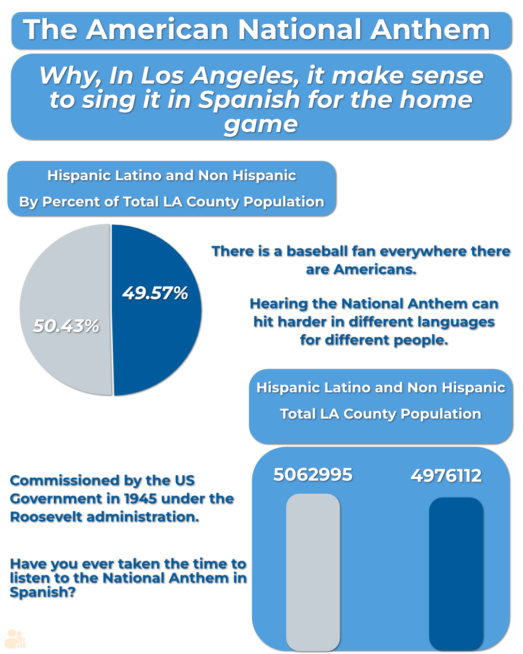
🙌 Dodgers & Spanish Anthem — LA Culture Signals
Singing the National Anthem in Spanish at Dodger Stadium? That’s not controversy — that’s community.
- ⚾ Nearly 50% of LA County identifies as Hispanic or Latino
- 🎤 One of the largest Spanish-speaking populations in the U.S.
- 🧂 Cultural pride echoed from dugout to upper deck
When Nezza took the mic, she wasn’t making headlines — she was reflecting the heart of the crowd.